Overview:
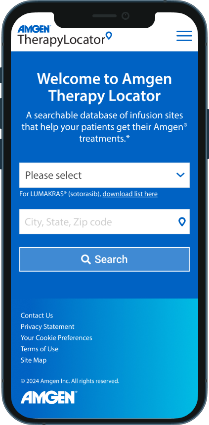
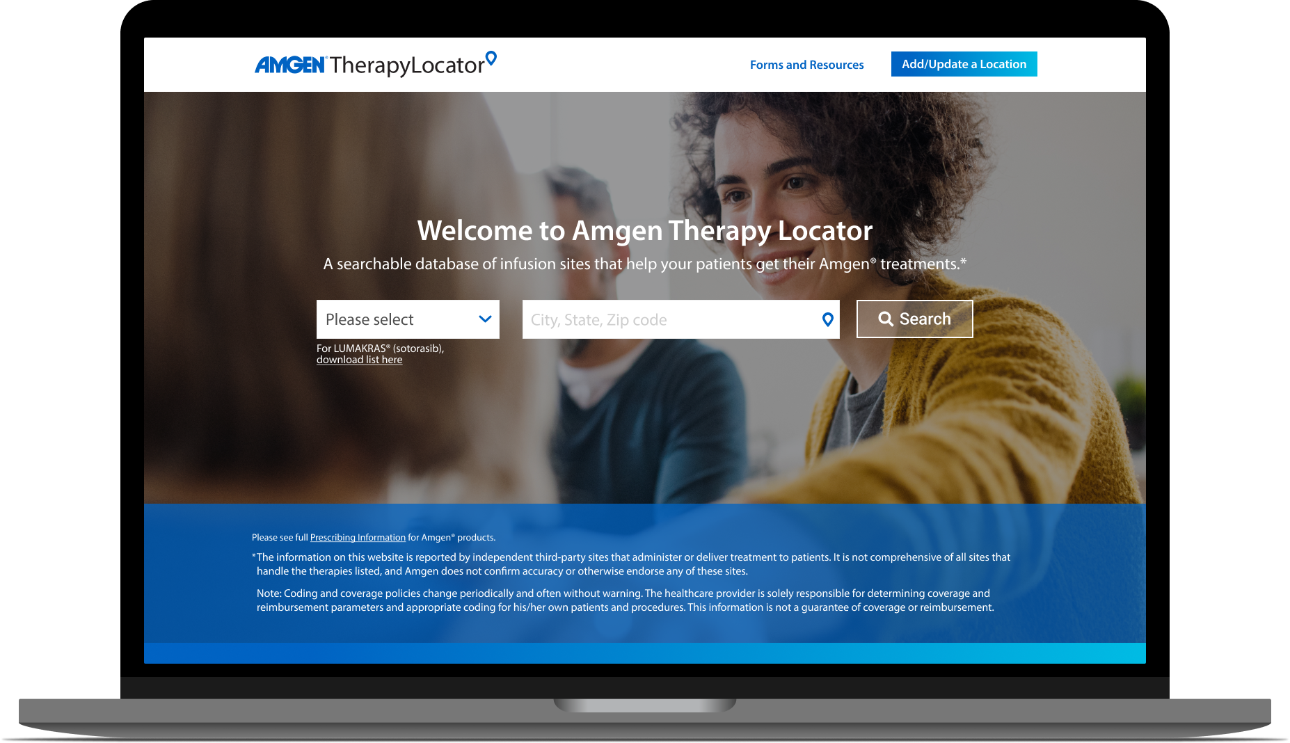
Amgen developed a website where patients could search for their prescribed treatments based on how close a therapy center is to their location. Unfortunately, it was not being used by patients. I was tasked with redesigning the website to increase traffic, justify business costs, improve usability, and offer more useful features for users.
My Role:
UX Researcher and UX Designer
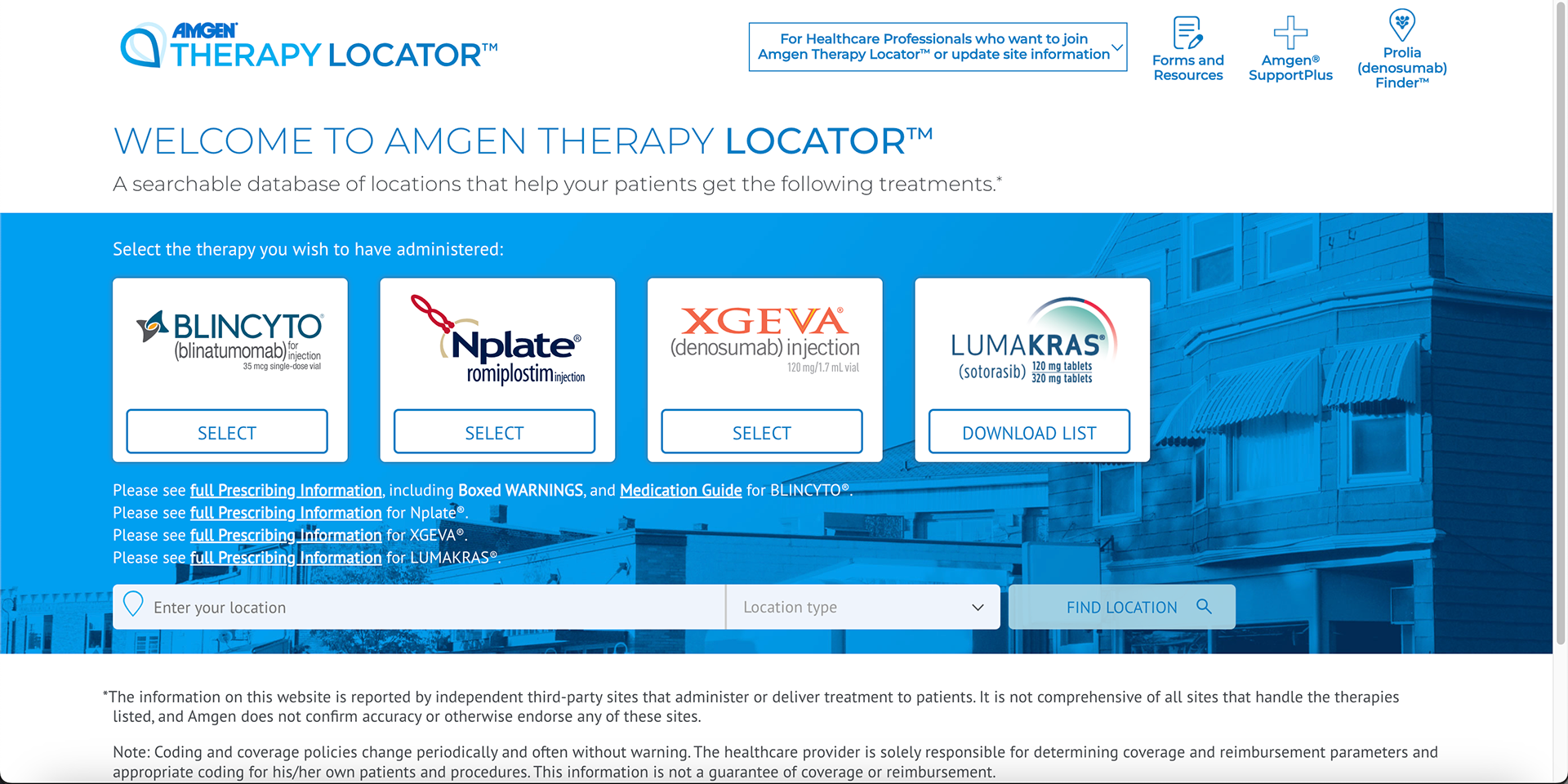

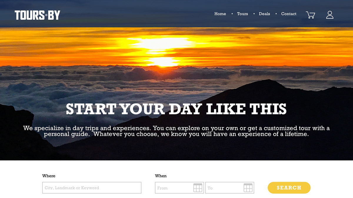
Homepage Before Homepage After
Identifying the problem: no hierarchy, little filters, dated design
I wanted to approach identifying pain points from an analytical and empathetic perspective. First, I gained access to the behind-the-scenes data, and looked into drop-off points, how much traffic pages got, and how long people spent on the site. Then, I combed through each page of the existing site on a desktop, tablet, and mobile. I assessed each page for usability, accessibility, and design, I compiled my thoughts in a PowerPoint to present to our team.
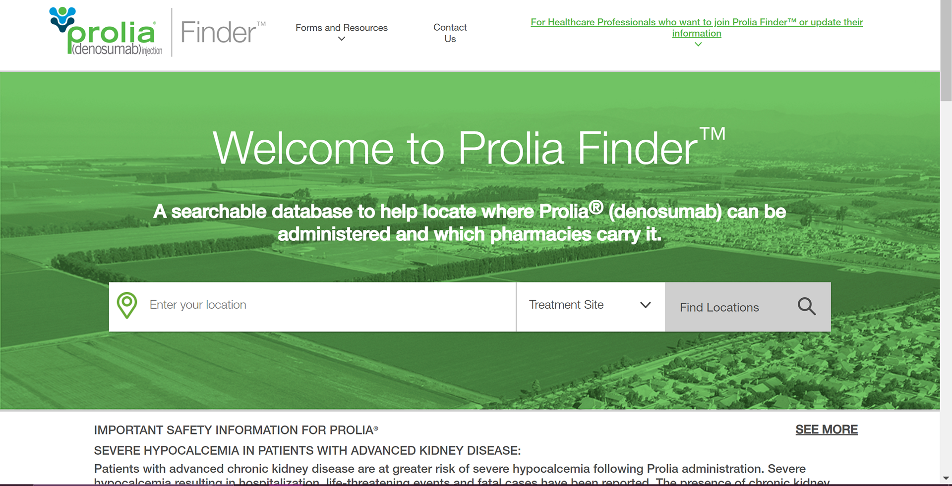
Snapshot of competition:
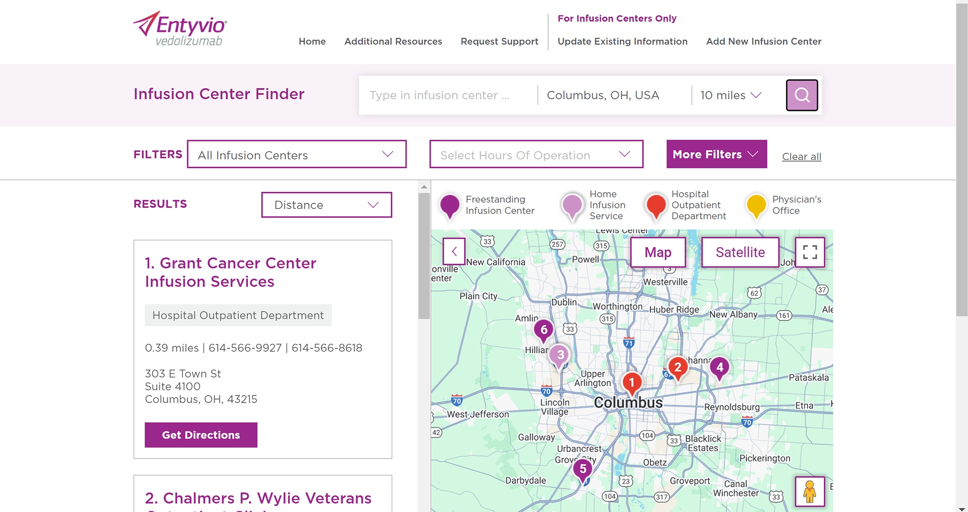
Example of my UX audit notes:
My findings could be boiled down to three points:
•Confusing hierarchy
•Lack of features users actually want
•Busy, dated design
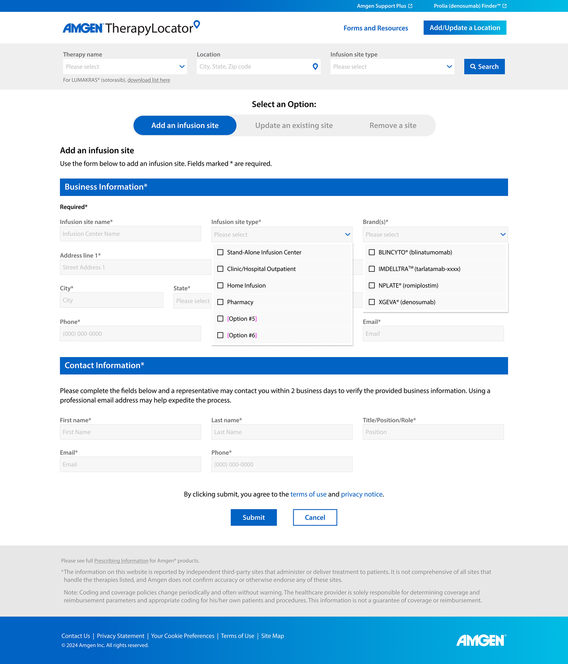
I presented the team with two options. Version 1: Improve the hierarchy, rework navigation, add 'more details' option on the map page, and make the update an infusion site usable- basically an MVP option. Version 2: Includes everything in version 1, plus adding more detailed filters on the map page, on top of an entire visual overhaul, and integrating AI to update location data. These options were presented because I wanted to give stakeholders clear information on what to prioritize, since developers, the clients, project managers, and designers had different priorities for this project. We decided to option two which was a win for our agency, users, and the clients.
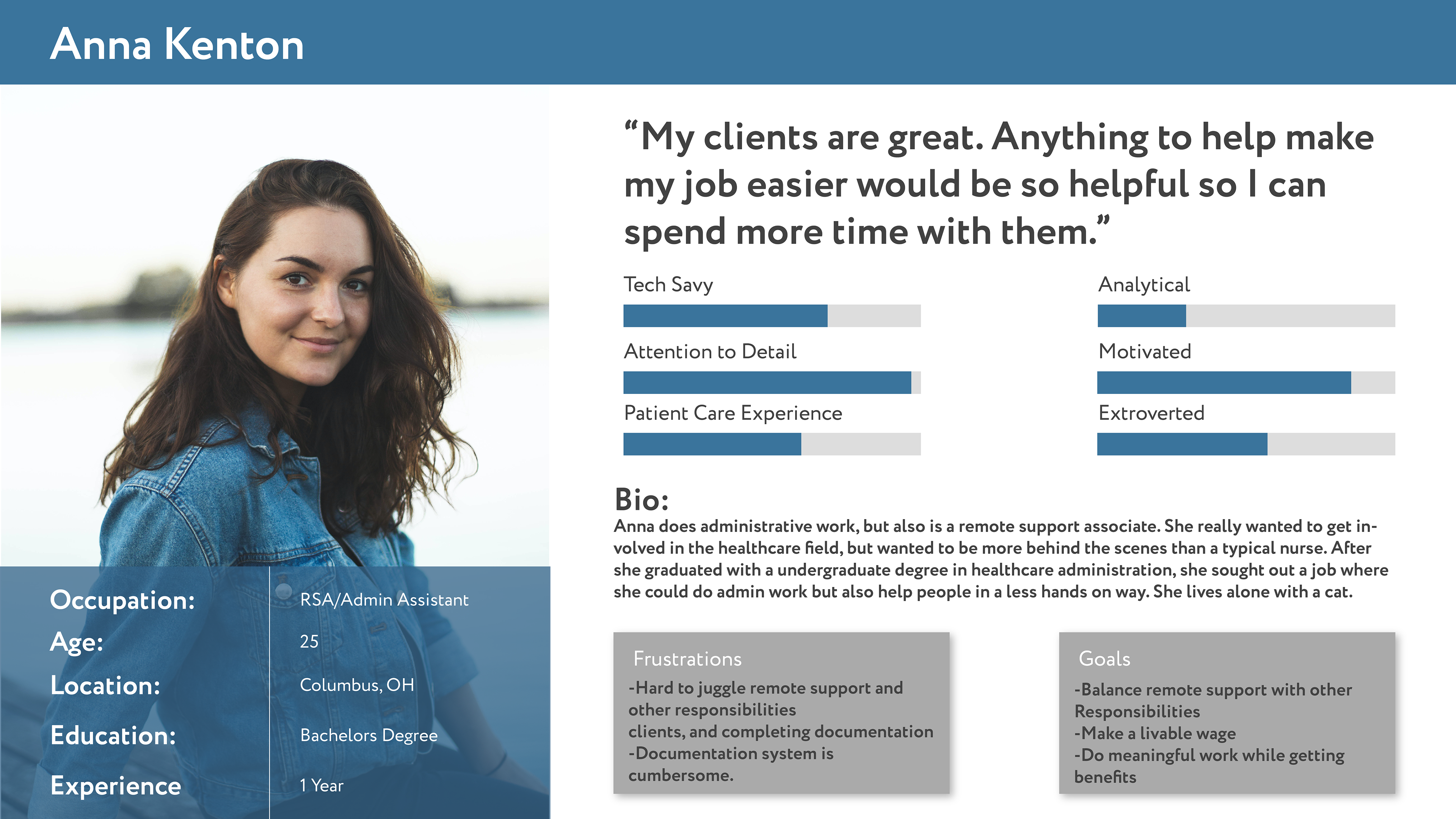
Personas: Who are we designing for?
Sitemap: Plotting out the redesign
Wireframes: putting findings into features

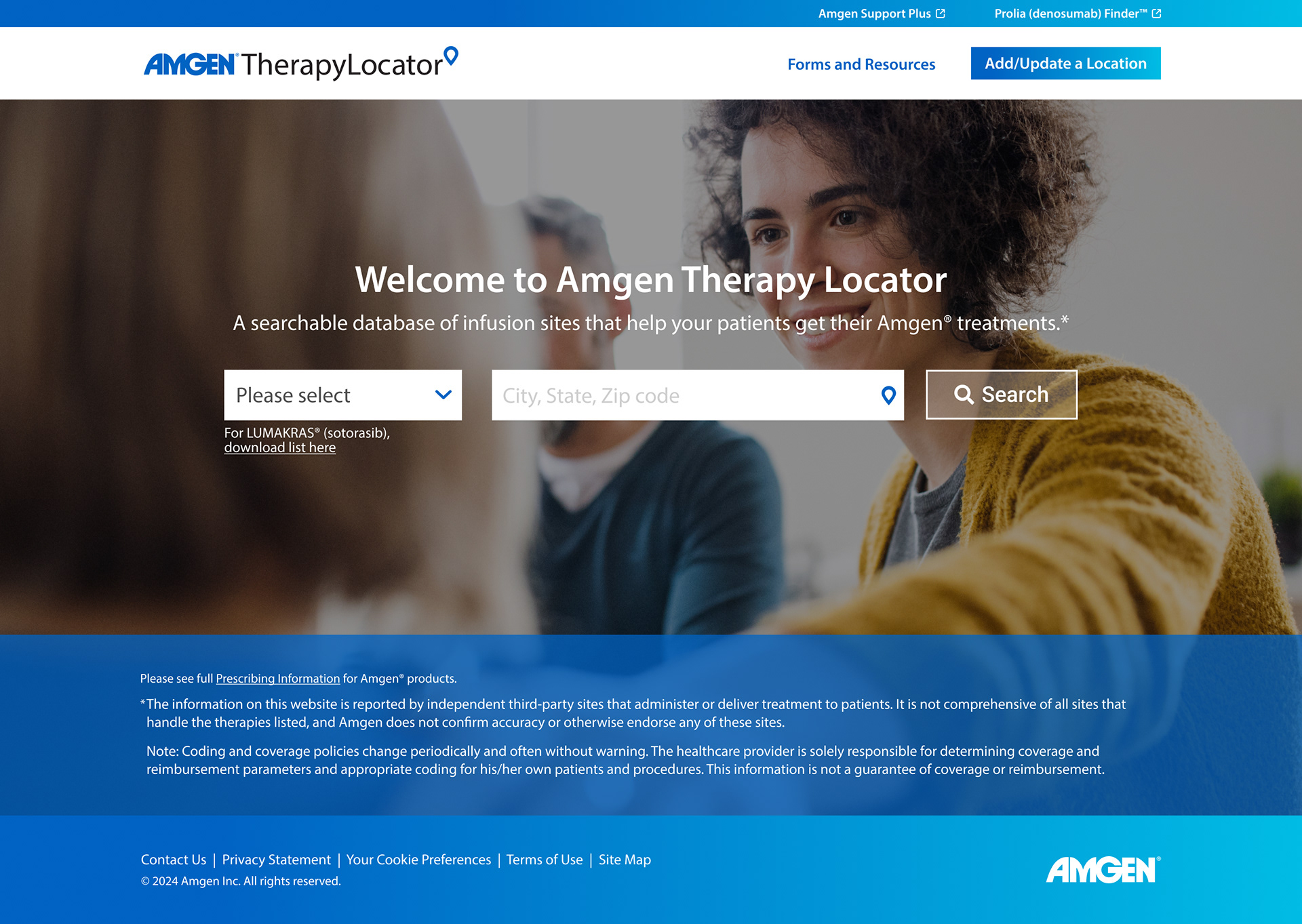
Homepage that centers search function, less clicks start searching, cleaner navigation

Mobile
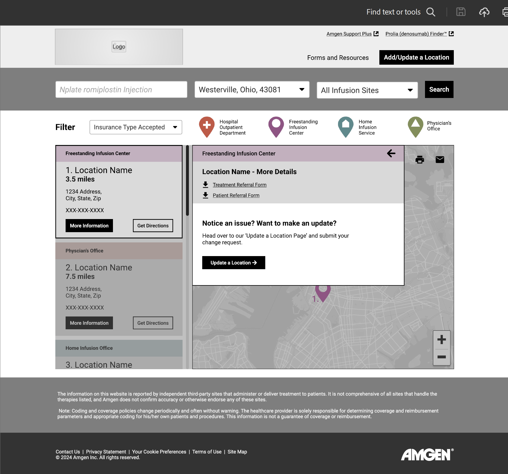
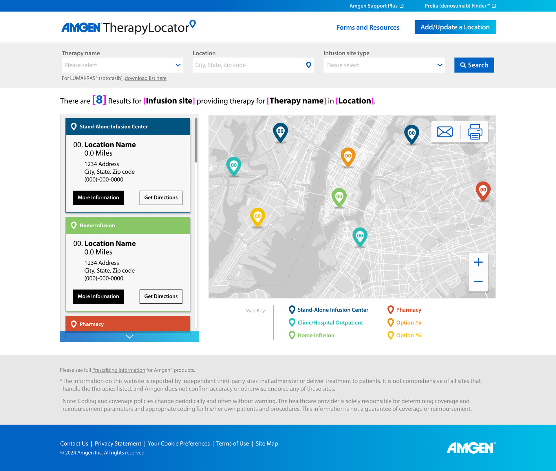
Map with new filters, more details, popup, cleaner hierarchy.

Mobile
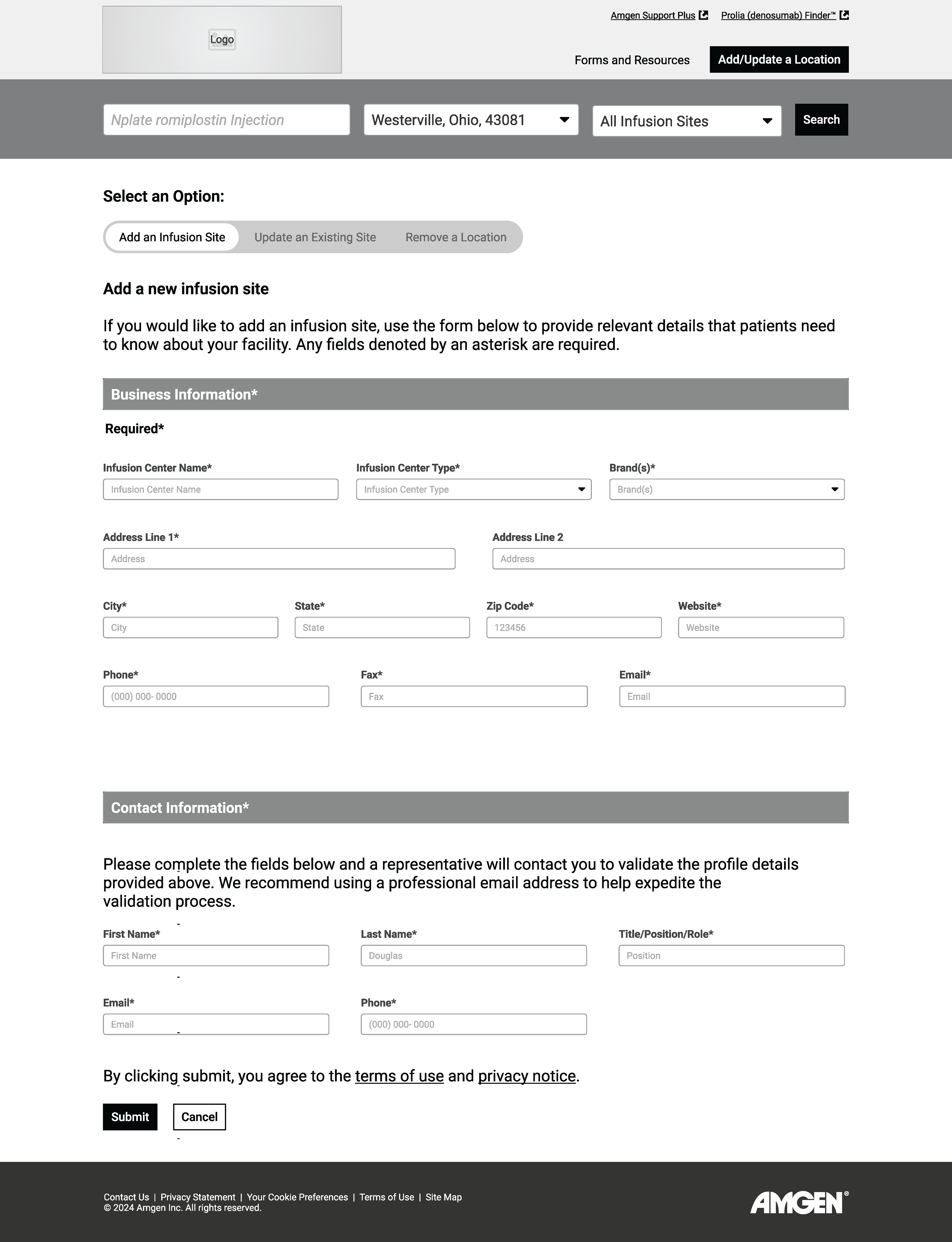
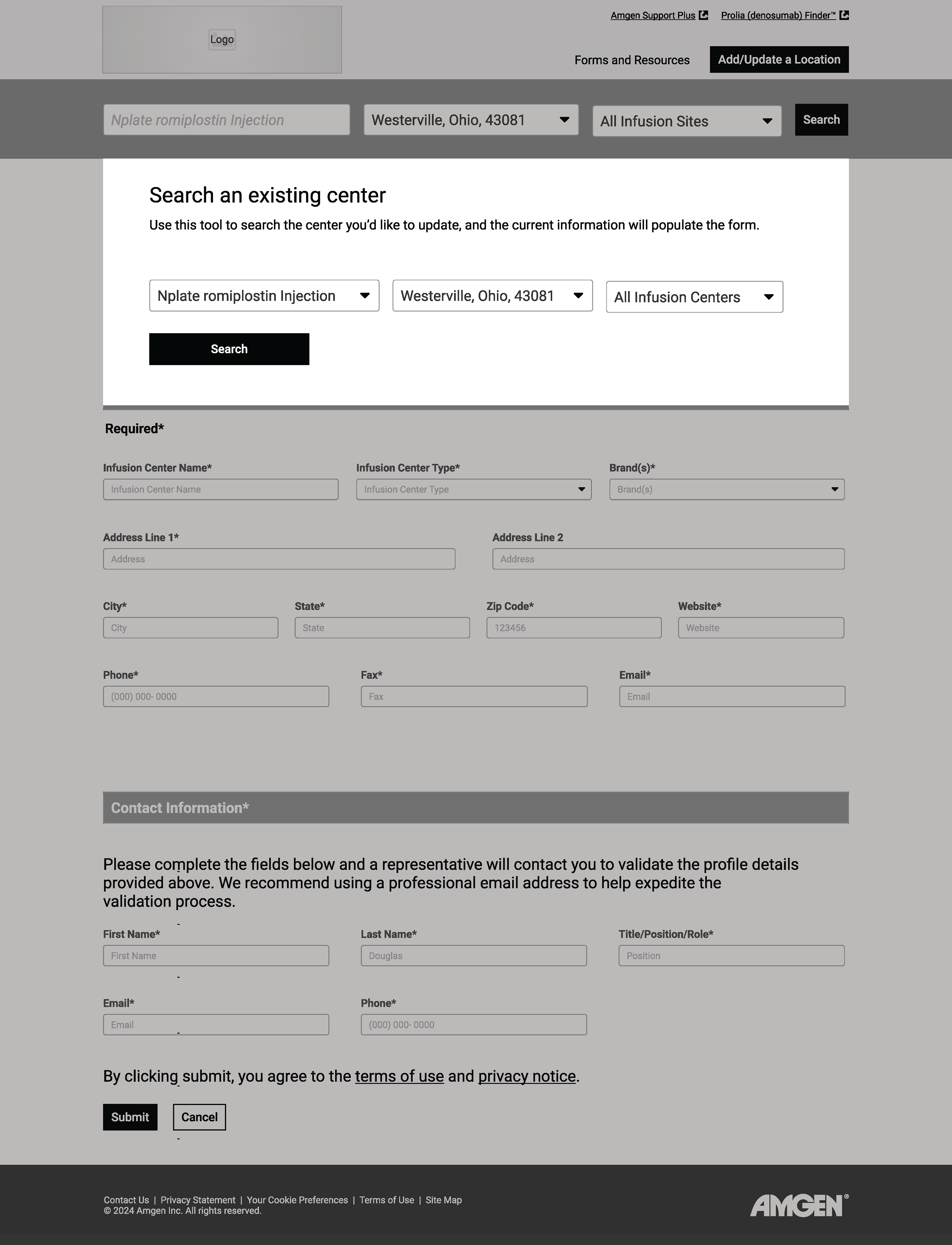
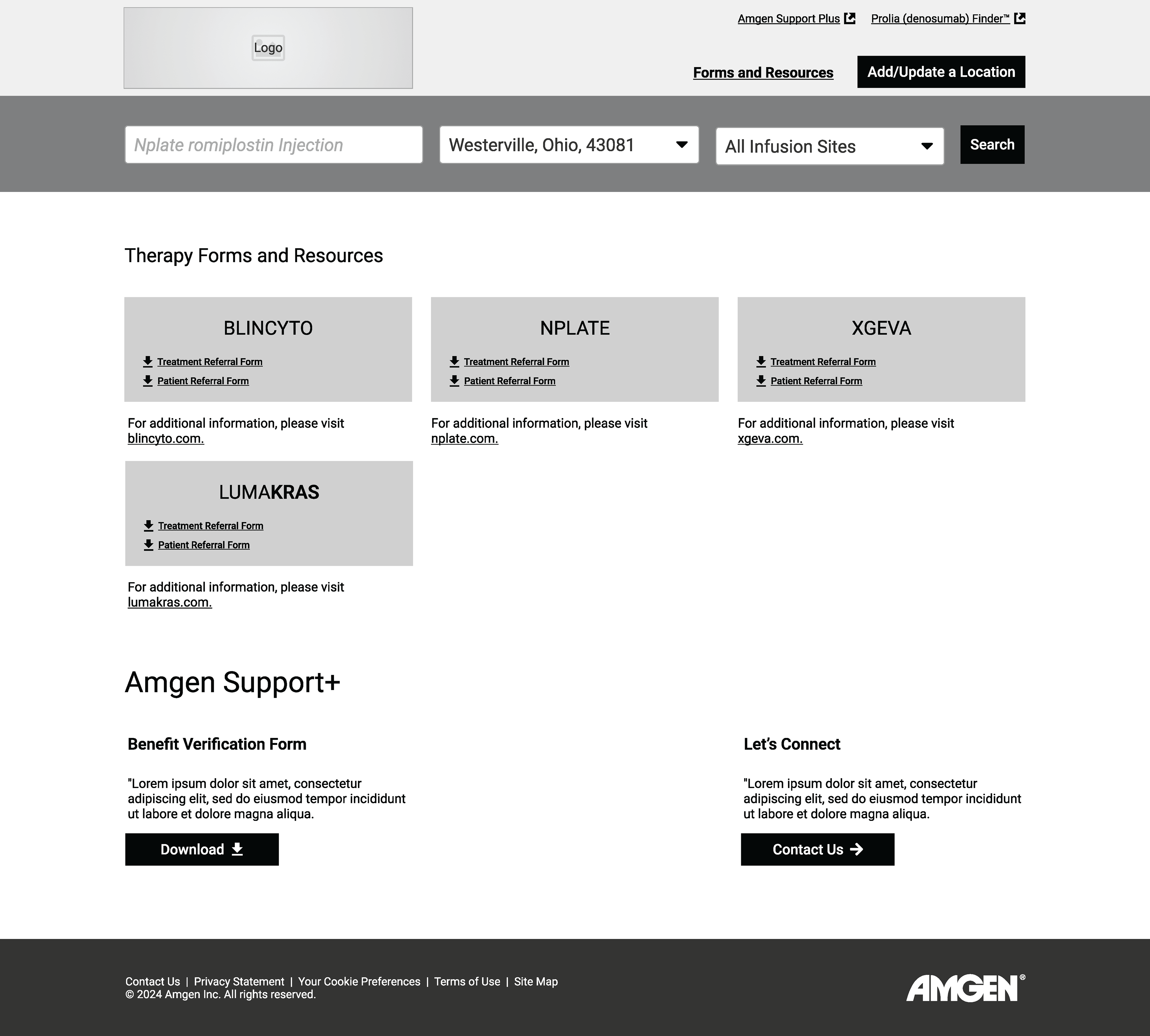

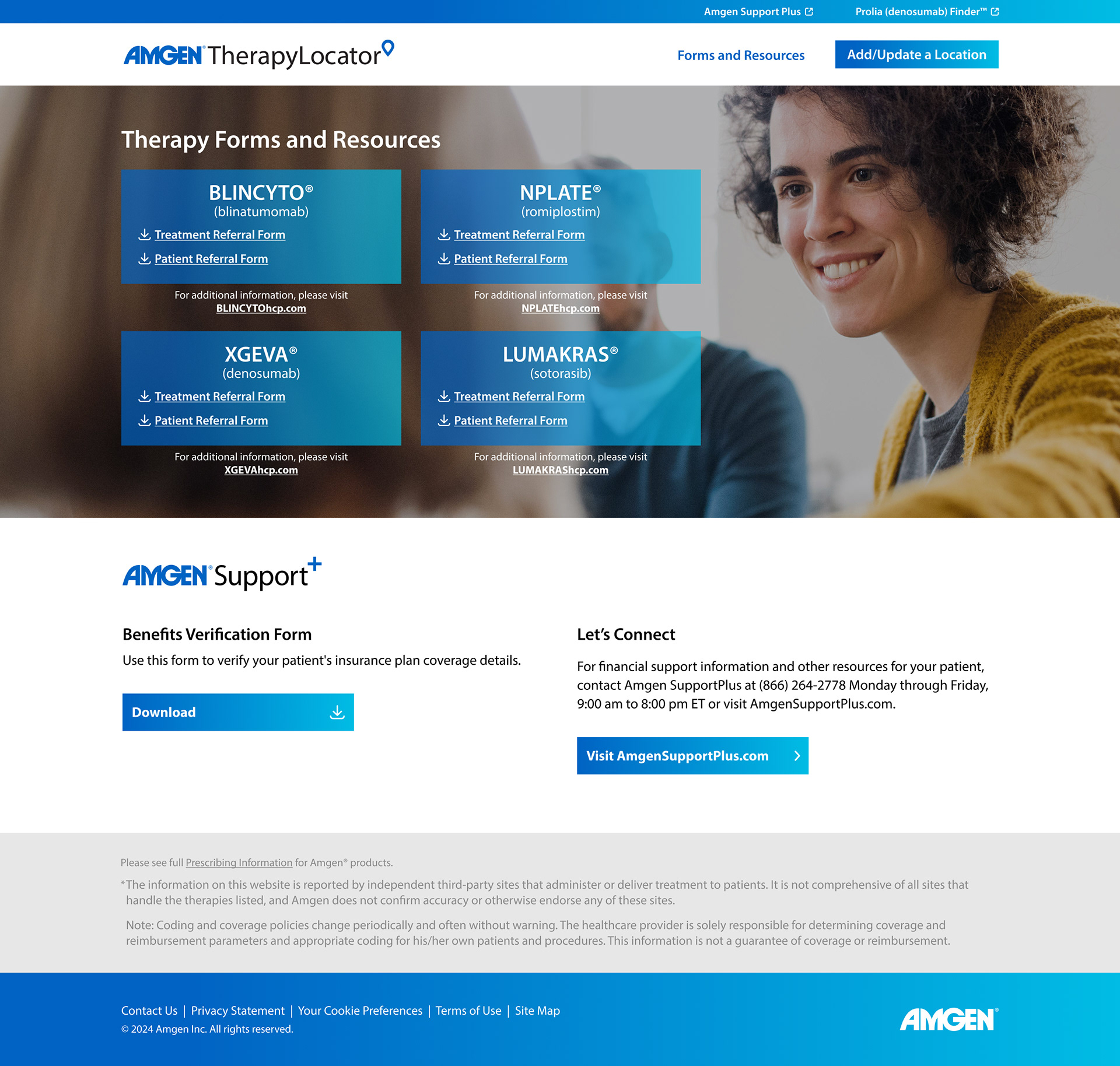
Version 1 complete: Final design




Conclusion:
The project by every metric was a success. It was completed on time, we learned new information about user needs, created a site that fit those needs, improved the aesthetic and readability, and most importantly, helped real people while meeting our client's needs. We did all this while bringing more business to our agency than initially anticipated.
I don't have access to the new behind-the-scenes data, but after launching the marketing campaign promoting the updated site, we got an enthusiastic email from Amgen saying they were a consistent spike in users a month after launch by at least 25%, and that they loved our work. Going forward, we need to make sure Amgen's partners and HCPs promote the site so patients know it is a resource that they can use. The next phase of the site is making it even more useful by adding more filters for patients on the map, and utilizing AI to keep location data up to date, and promoting it to users.
I learned a lot about user behavior and pivoted map designs while working on wireframes by sending them over to the client for testing, and remained agile by not marrying any assumptions of user behavior while I created. This project helped me realize what was essential in the UX process while you're on a tight deadline, and working on something that already exists. I look forward to more opportunities like this- improving existing sites/apps to be more useful to users!
