My Contributions: Research, Marketing Copywriting, Branding Design, Site Maps, Lo-Fidelity Wireframes, Interaction Design, Illustrations & Iconography, Project Management, QA Testing
Client:
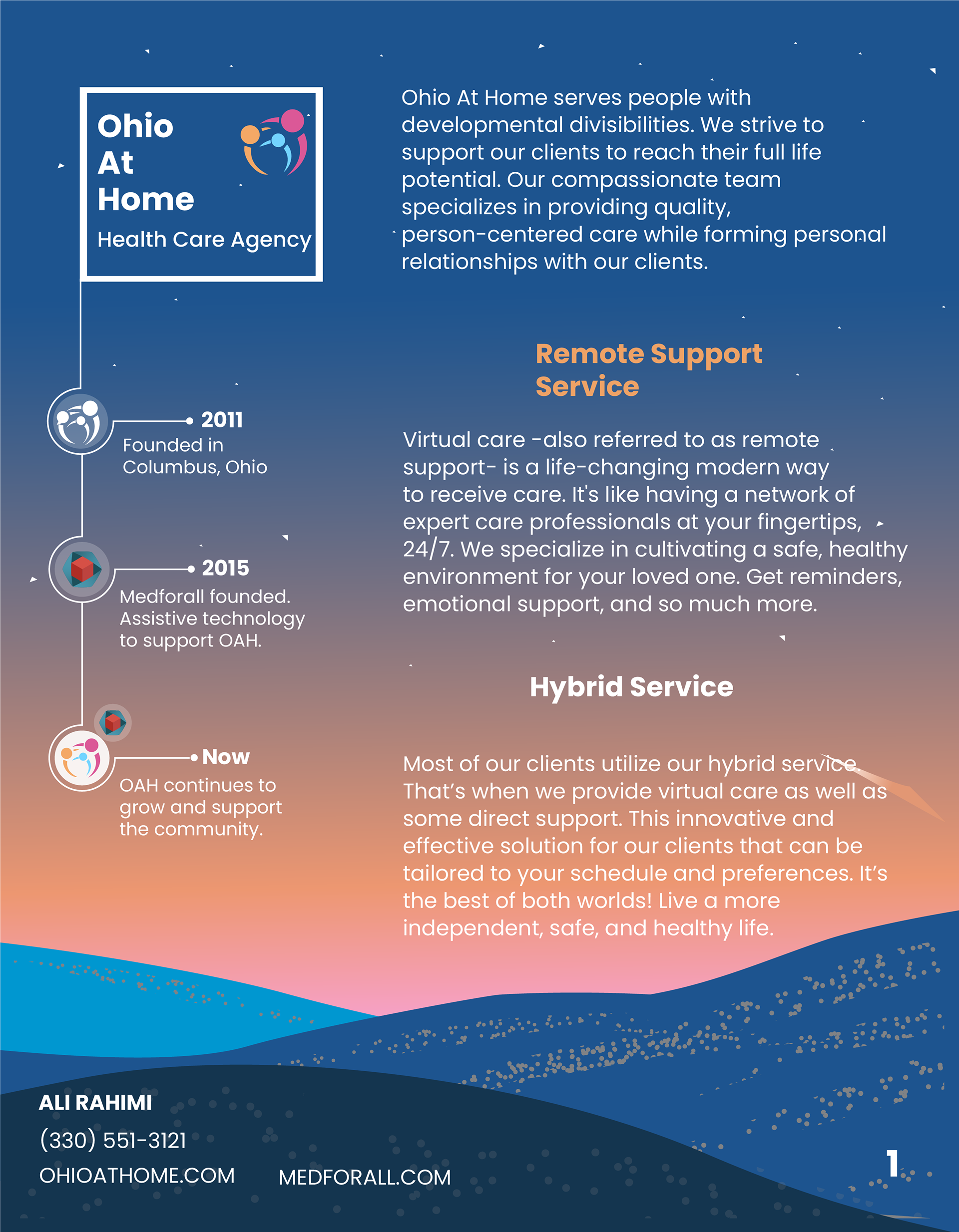
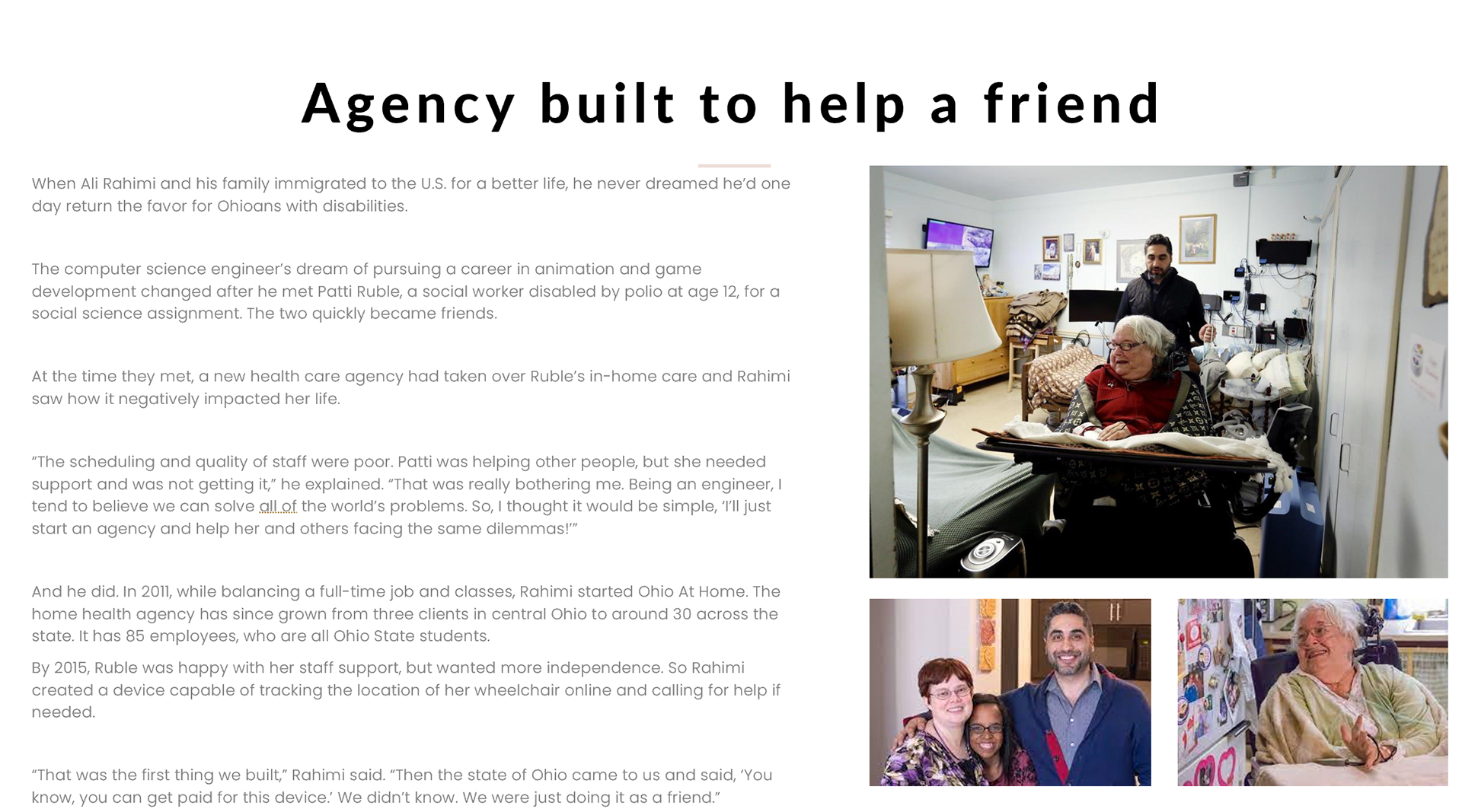
Ohio At Home is a healthcare agency based in Columbus, Ohio. They support people with developmental disabilities and are an integral part of our community.
The Problem:
OAH's old online presence was a bit lacking. There weren't any established brand guidelines. It was hard to find out what OAH is or a mission statement. There wasn't anything highlighting the wonderful patients or benefits for the employees. Even the current team weren't unified about what Ohio At Home really was, and how it was different from its' sister company, Medforall.
Through a competitive analysis I conducted of other healthcare agencies in the area, I found out some important information:
1. The demand for healthcare agencies is high, but staffing is low in almost all other companies. In a sea of competition, it is important to stand out to future employees and meet their needs.
2. The user base (patients) includes a wide spectrum of people. OAH serves young children all the way to the elderly, so a simple, minimal, but eye-catching experience/aesthetic is crucial.
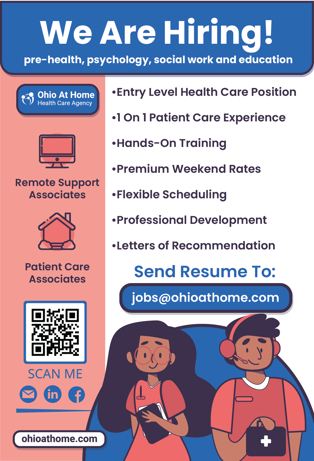
3. The employees are 90% students, so a modern, quick, and easy way for busy students to apply for a job and learn about the perks of working at OAH is critical to increasing new hires.
4. Agencies that have more presence online, create meaningful content, highlight benefits, and have a short application process have better reviews online from clients and employees.
The Solution: Rebrand & Overhaul
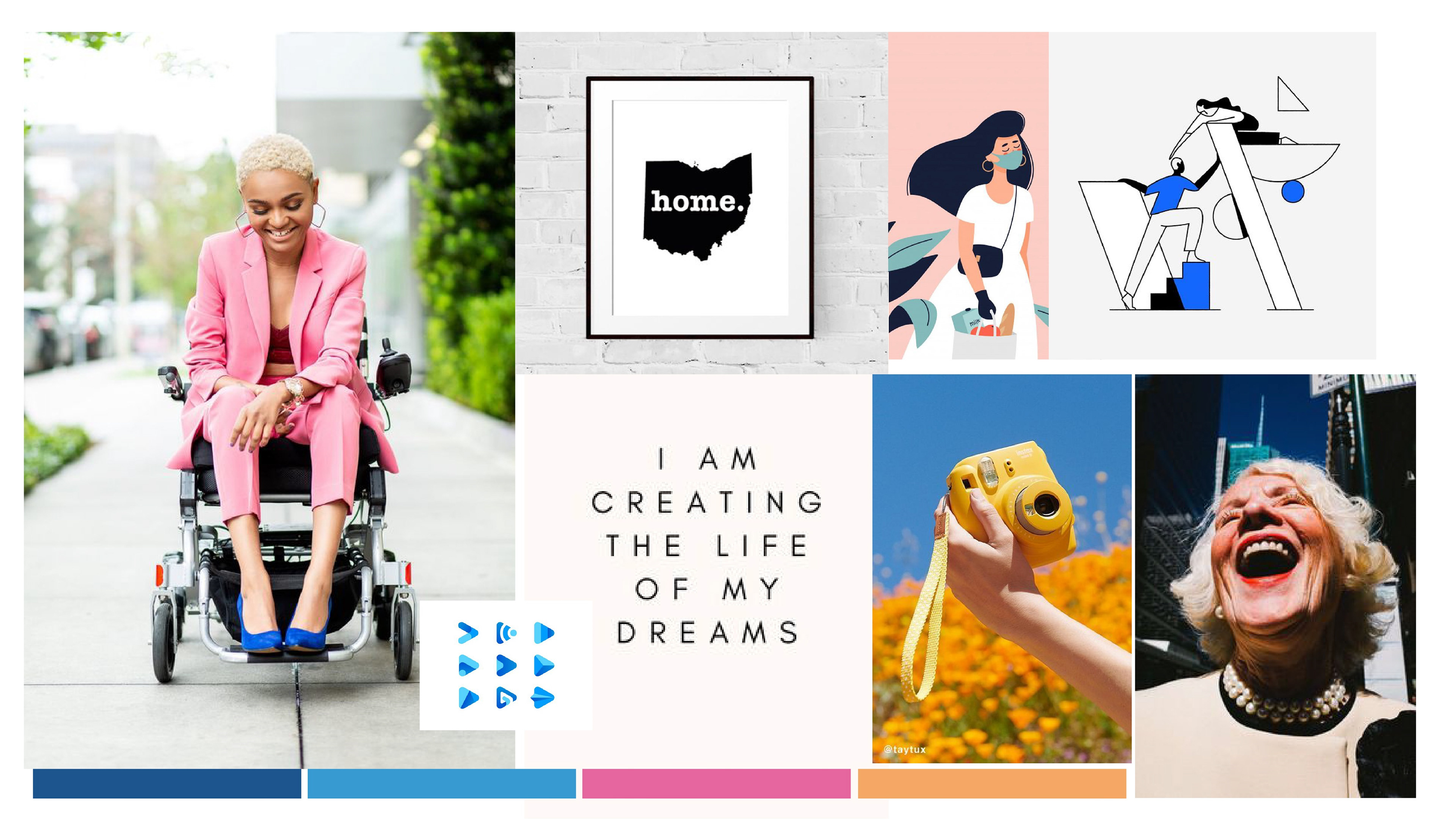
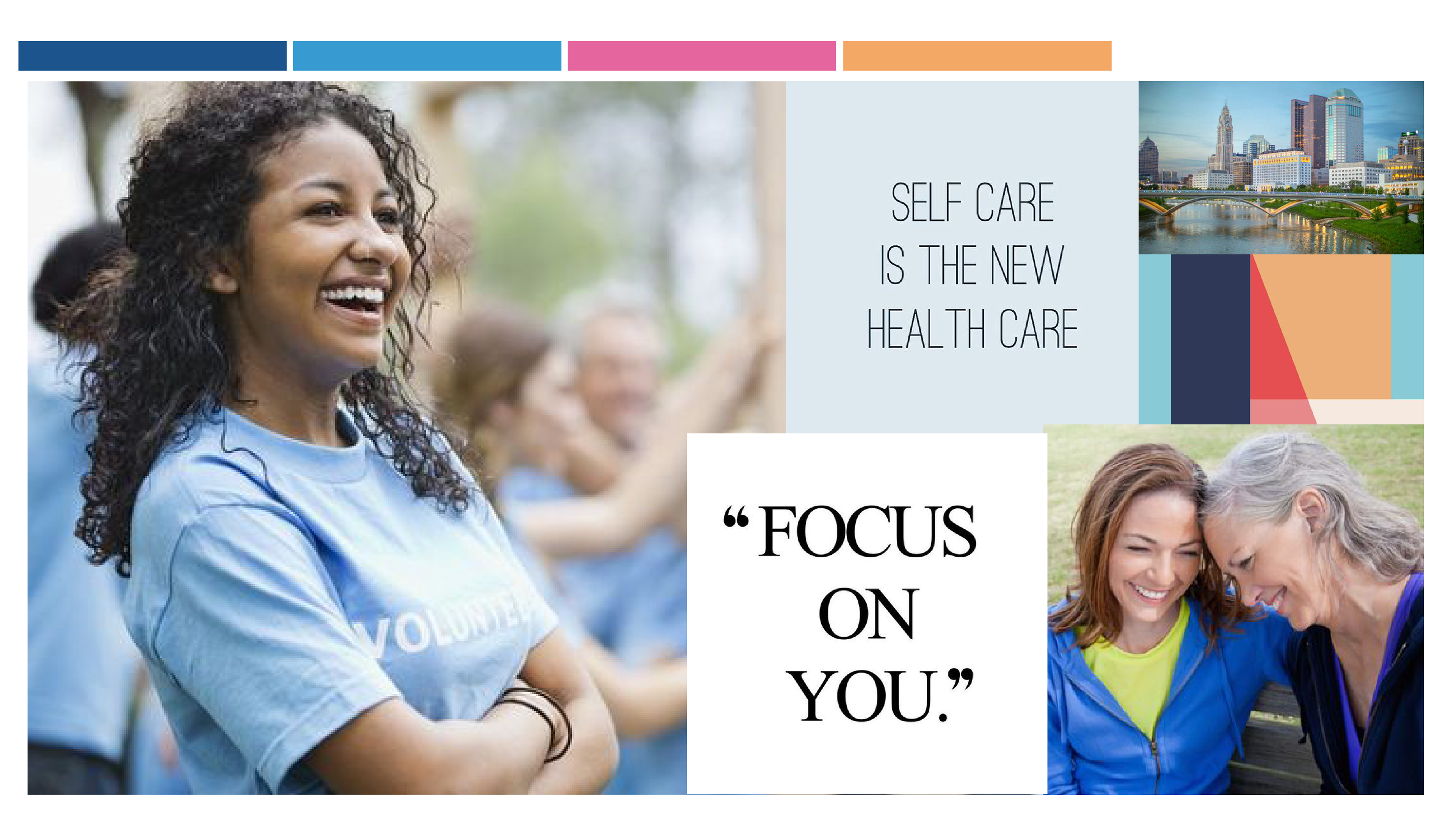
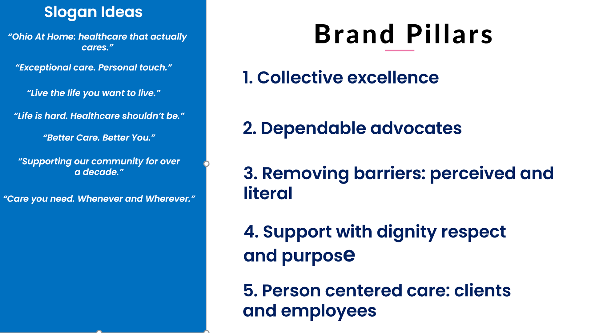
I wanted to start from square one. I believe in building a strong foundation, so I created a comprehensive powerpoint for the team to always reference when creating any OAH content. I established 11 point brand system, identifying these categories:
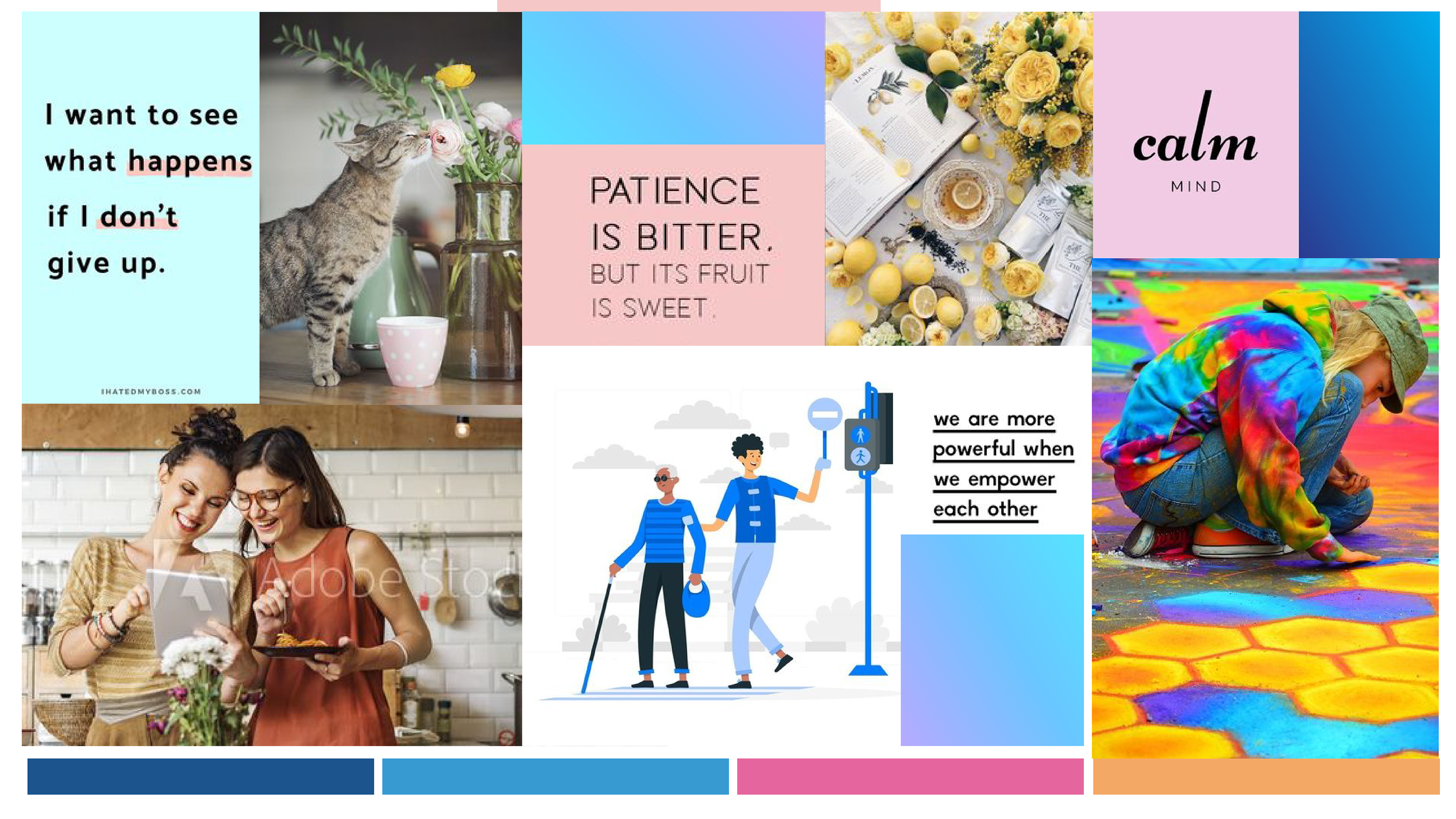
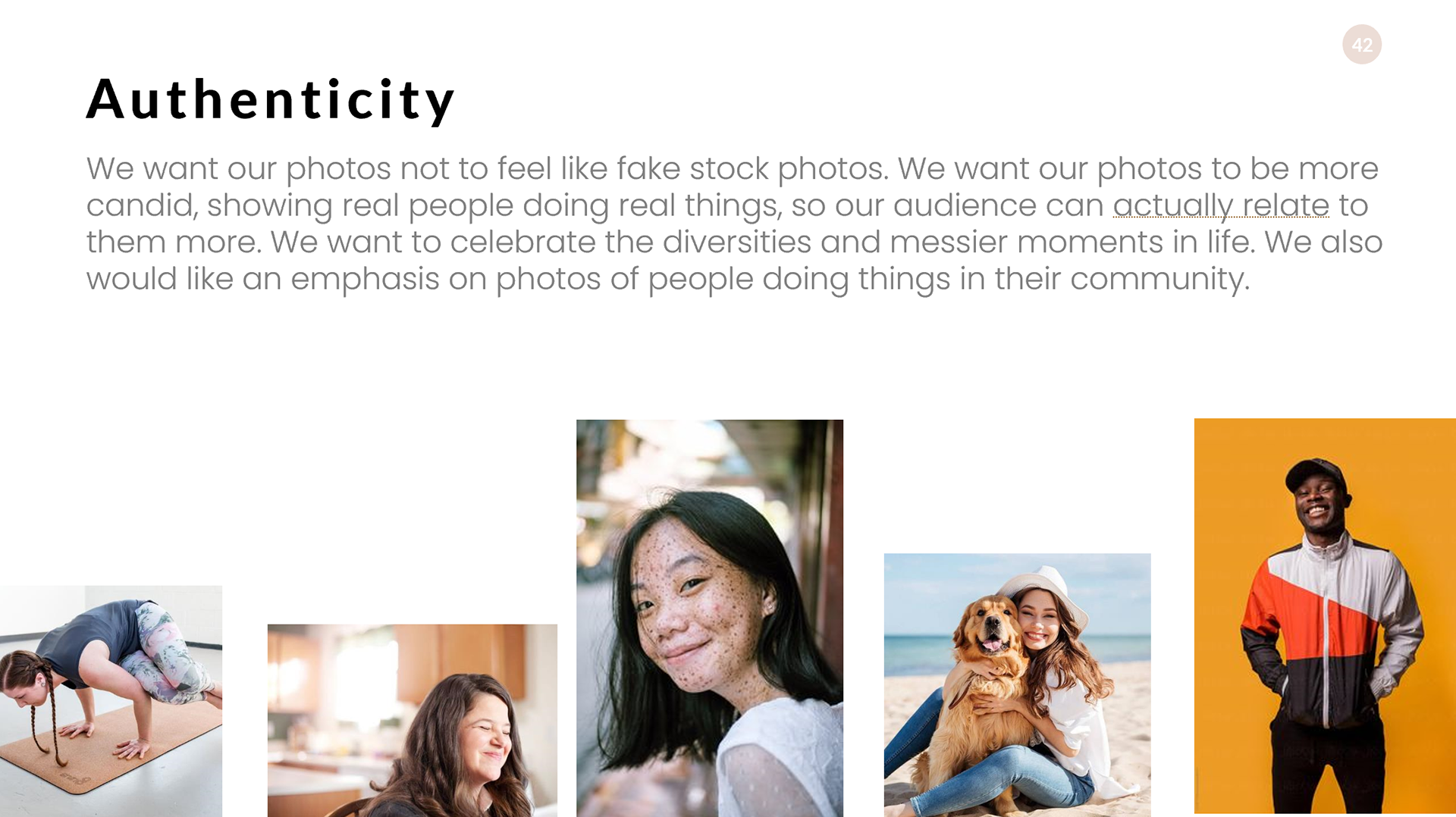
Introduction, Brand Pillars/Mission Statement, Brand Story, Inspiration/References, Moodboards, Color Palate, Typography, Photography Pillars, Tone Of Voice, and Identity in Context.
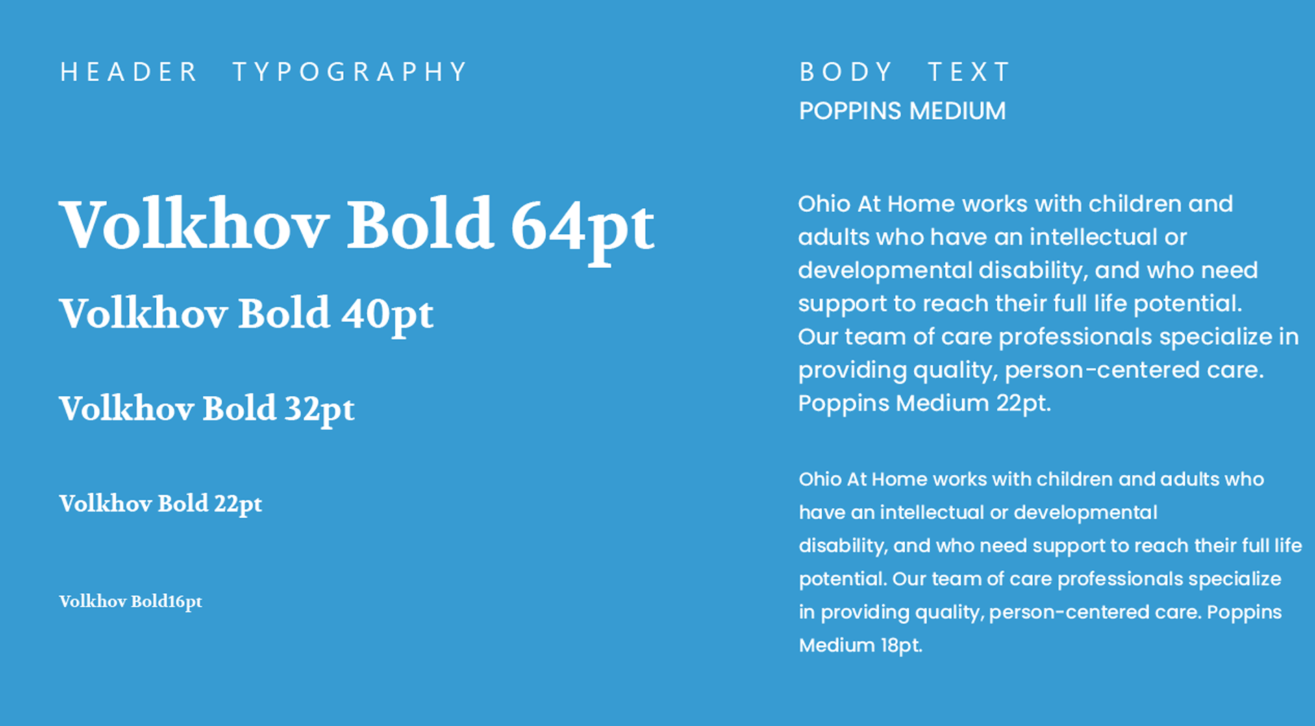
Here are some examples of these that I created to guide the redesign:
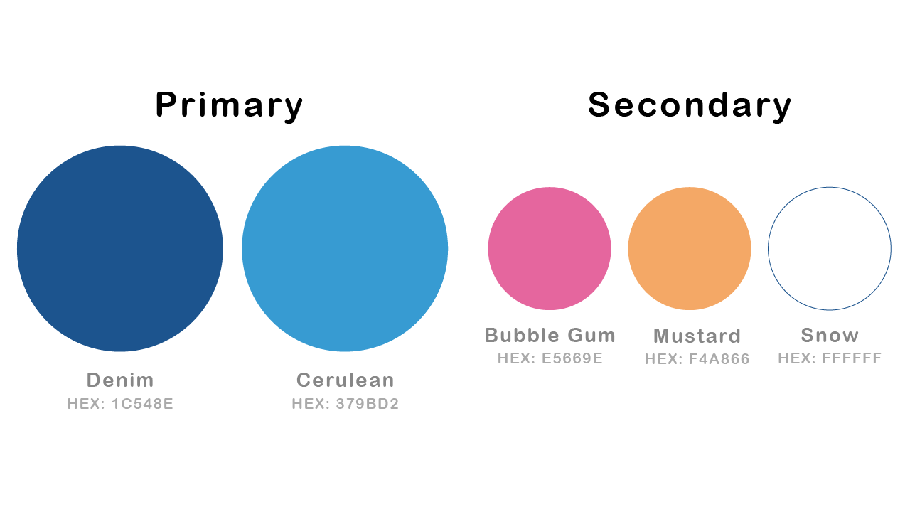
New Color Scheme:
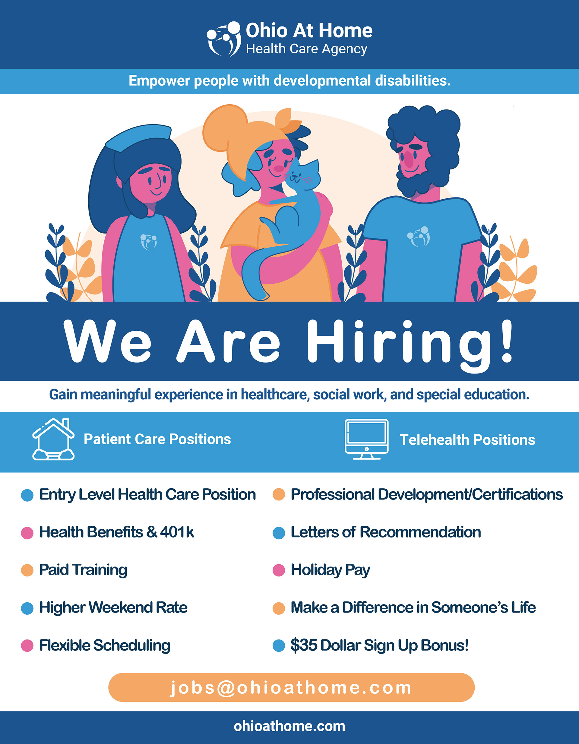
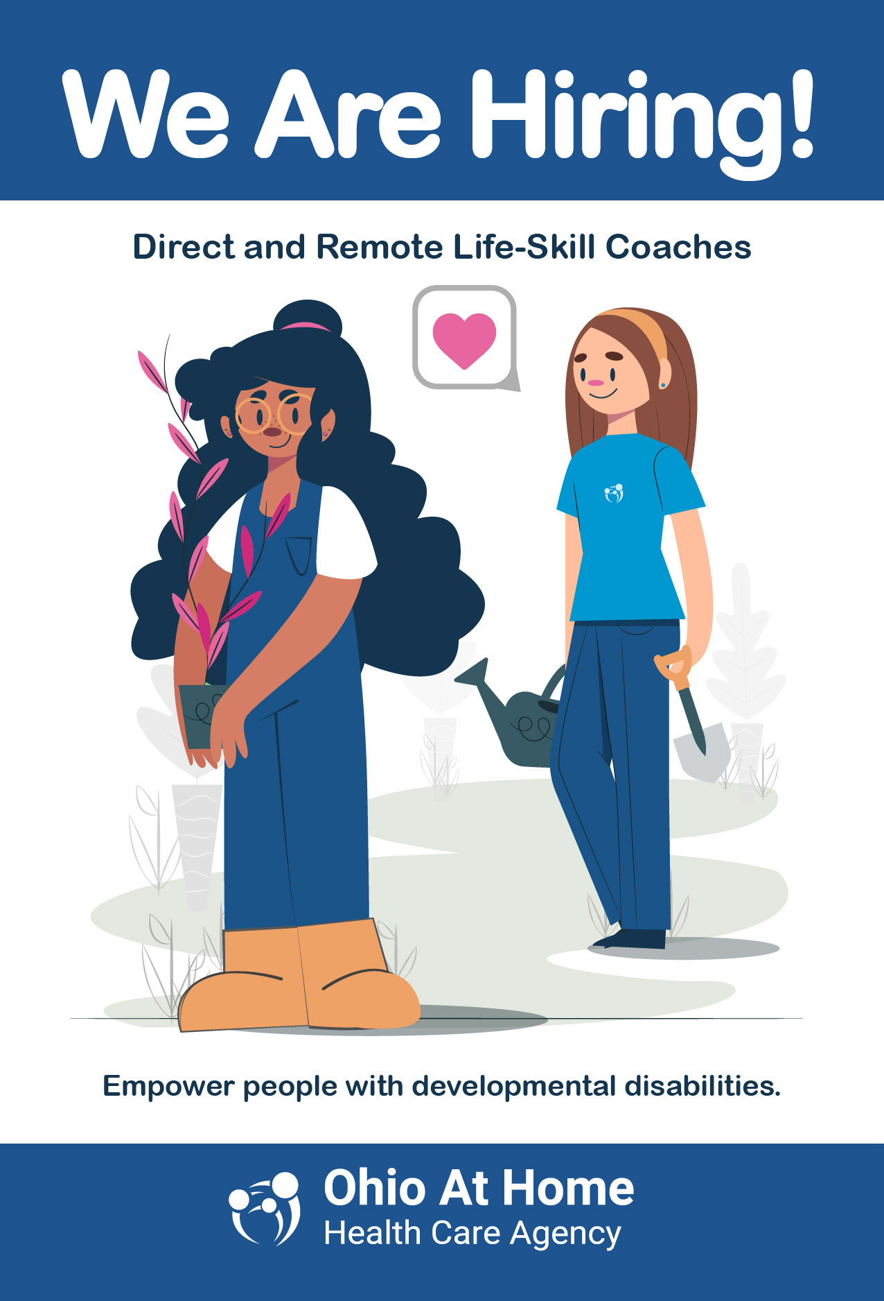
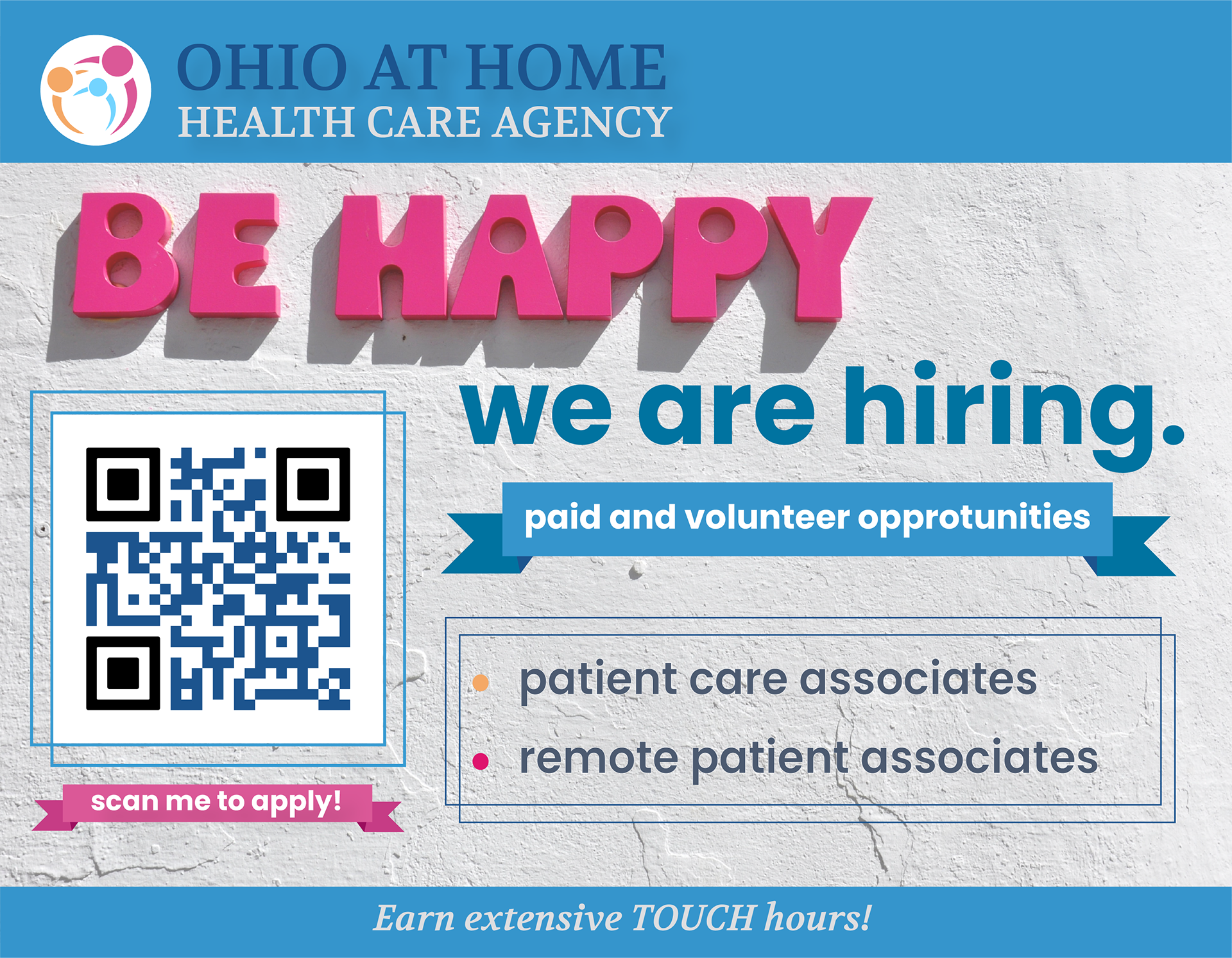
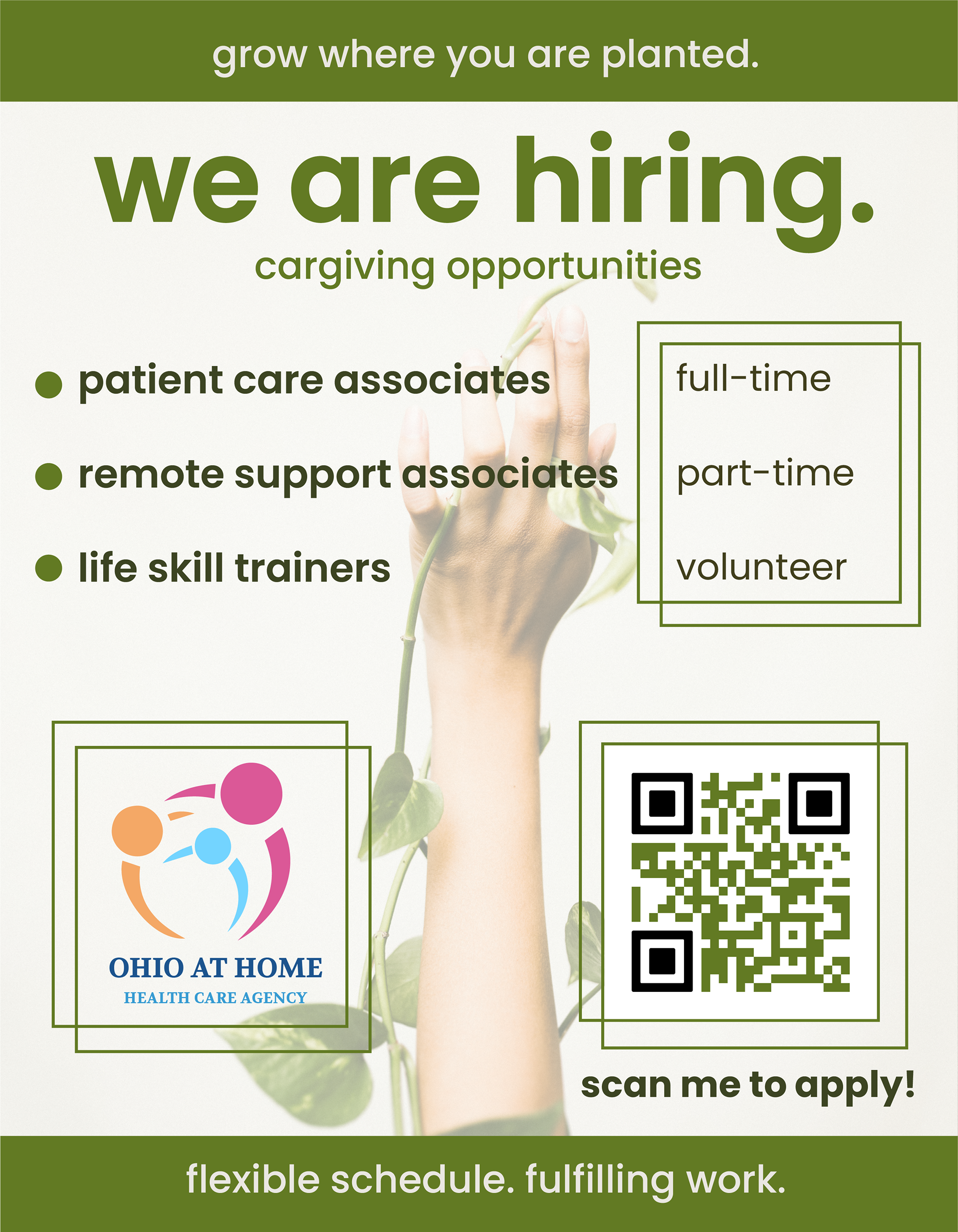
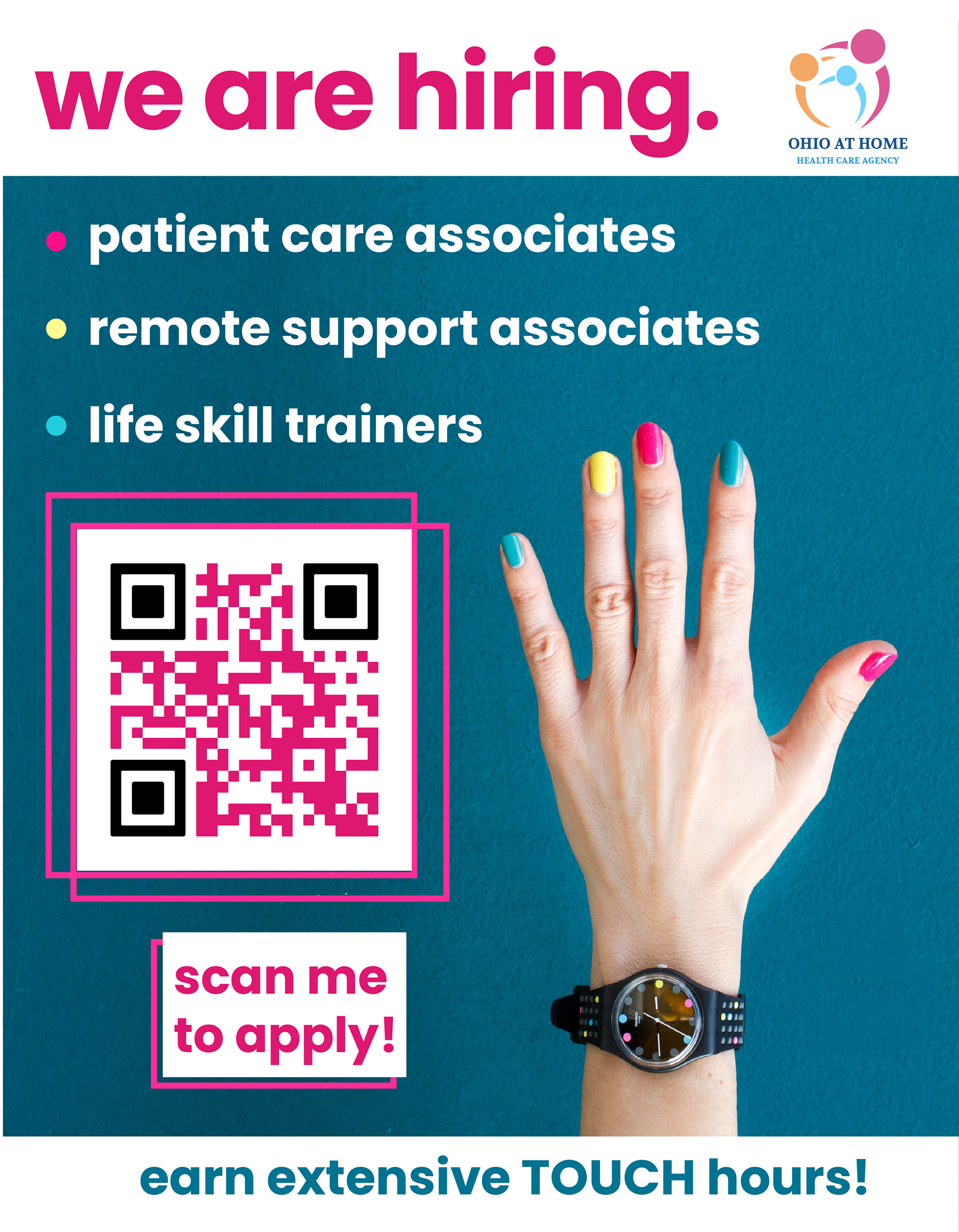
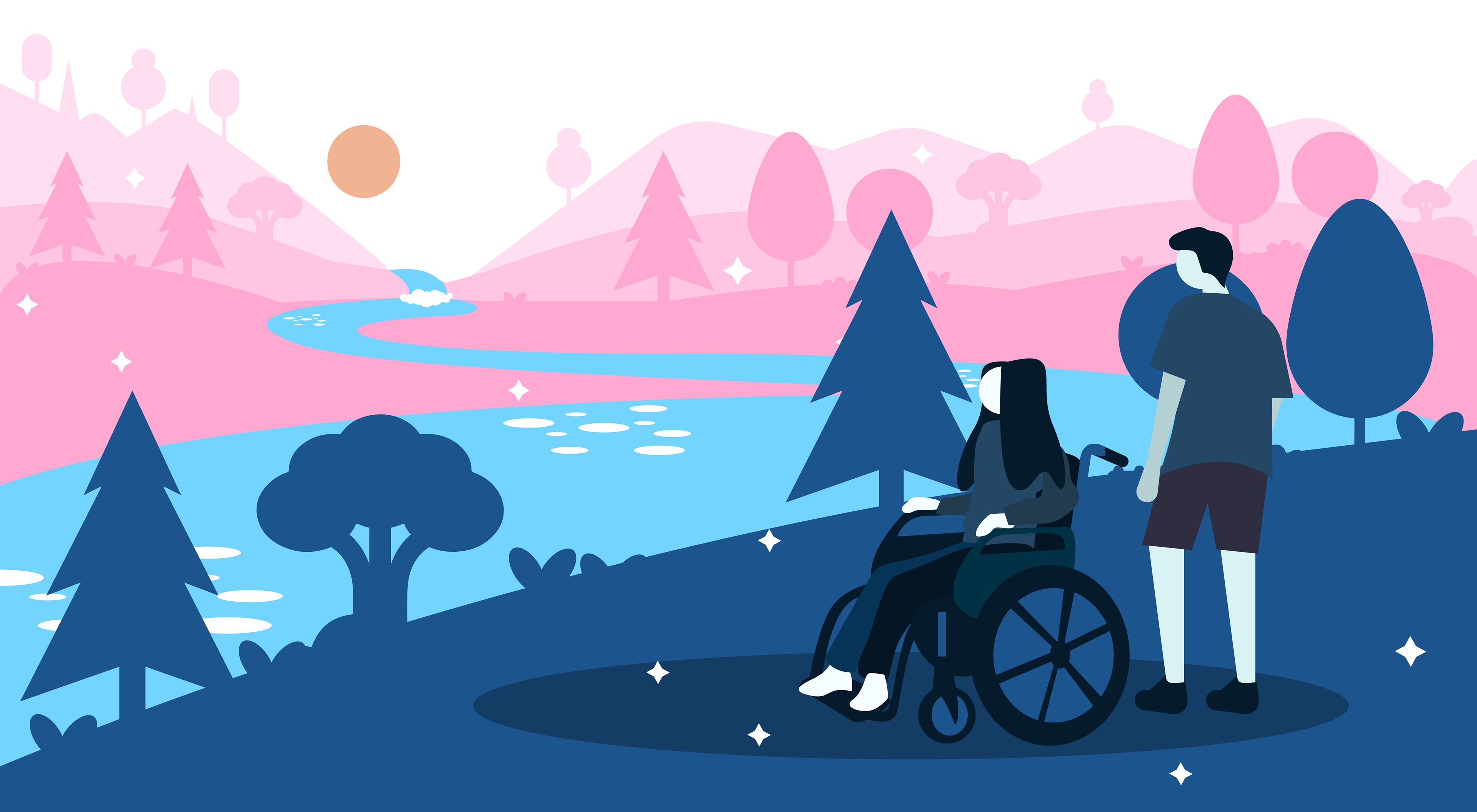
I wanted to pick a color scheme that was fun, inviting, and positive, while remaining professional. That's why I chose two shades of blue as the primary colors, since blue evokes a feeling of tranquility, peace, a professionalism. Many agencies have blue in their color scheme somewhere. However, considering the audience, I thought it was important to have some bright pops of color.
The shades of pink and yellow I created contrast wonderfully against the blue. Yellow can evoke feelings of optimism and positivity (important when you are considering healthcare) and I wanted the pink to be the element of fun. The new mission of OAH is to empower patients to not just survive, but thrive and enjoy their lives. That's why I thought the pink was playful companion that supported yellow's optimism.
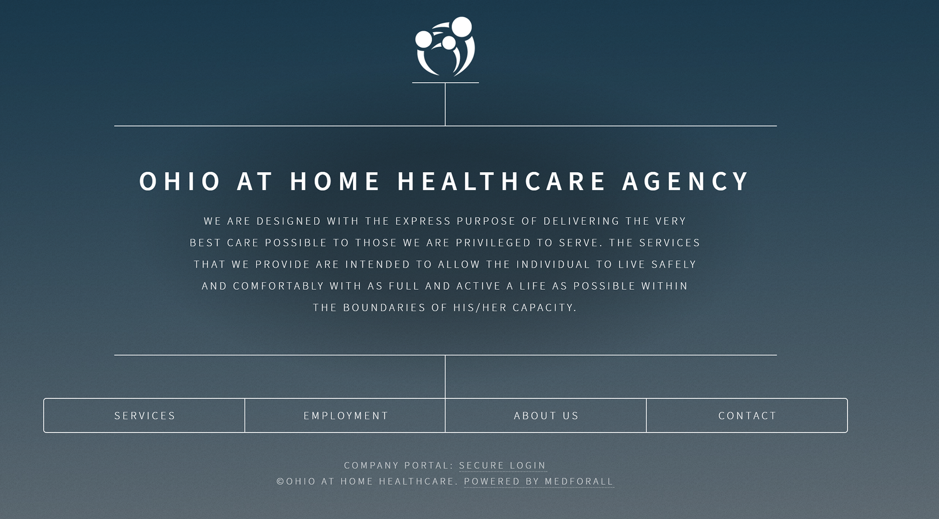
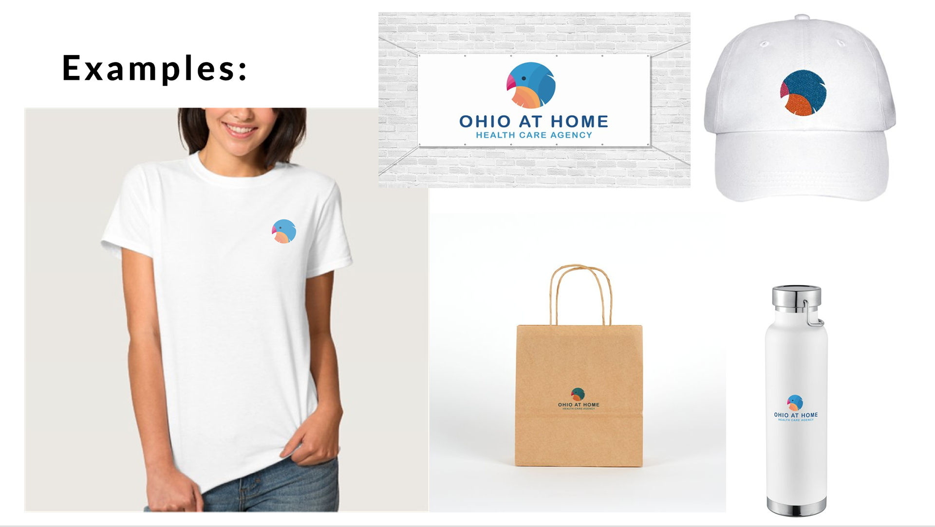
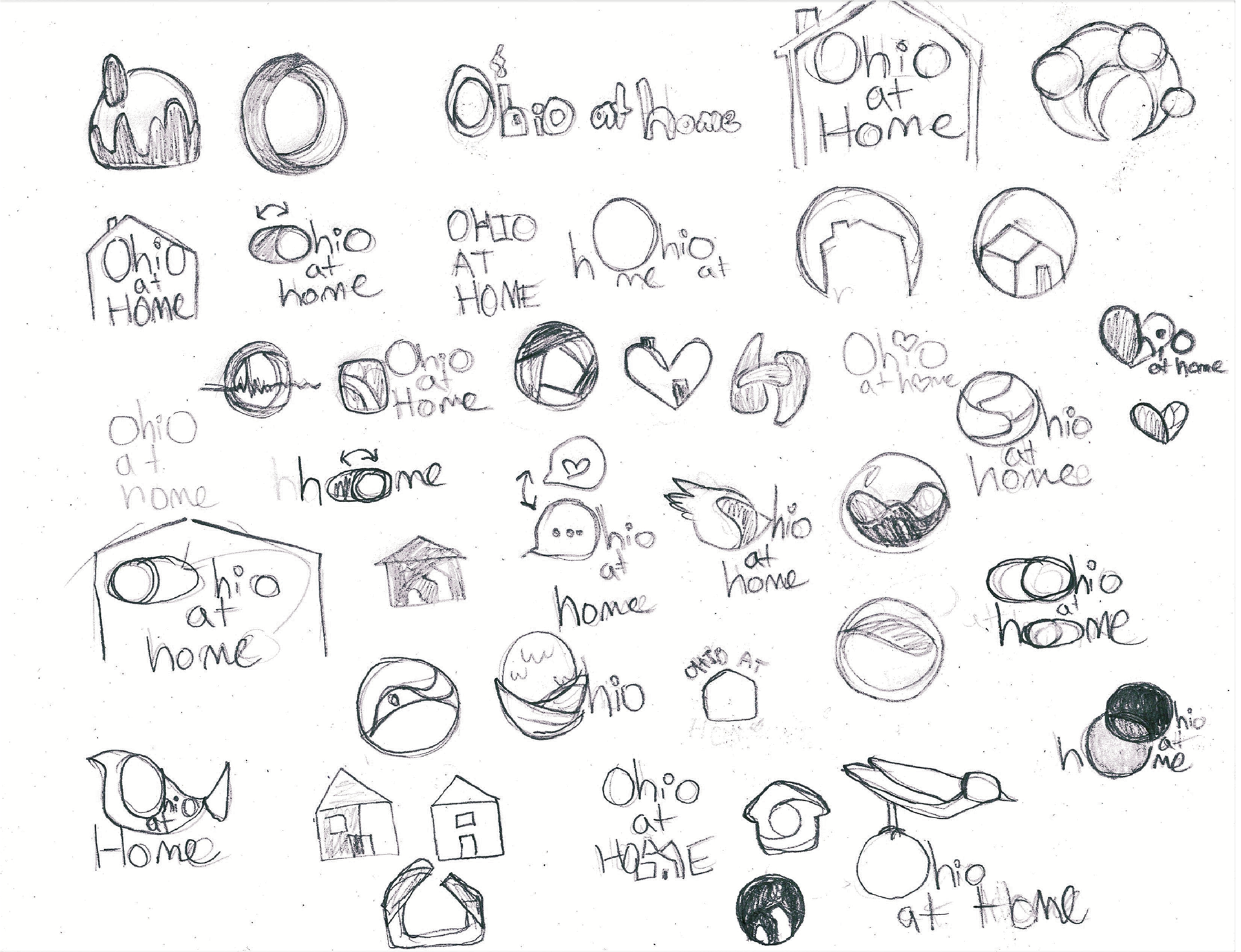
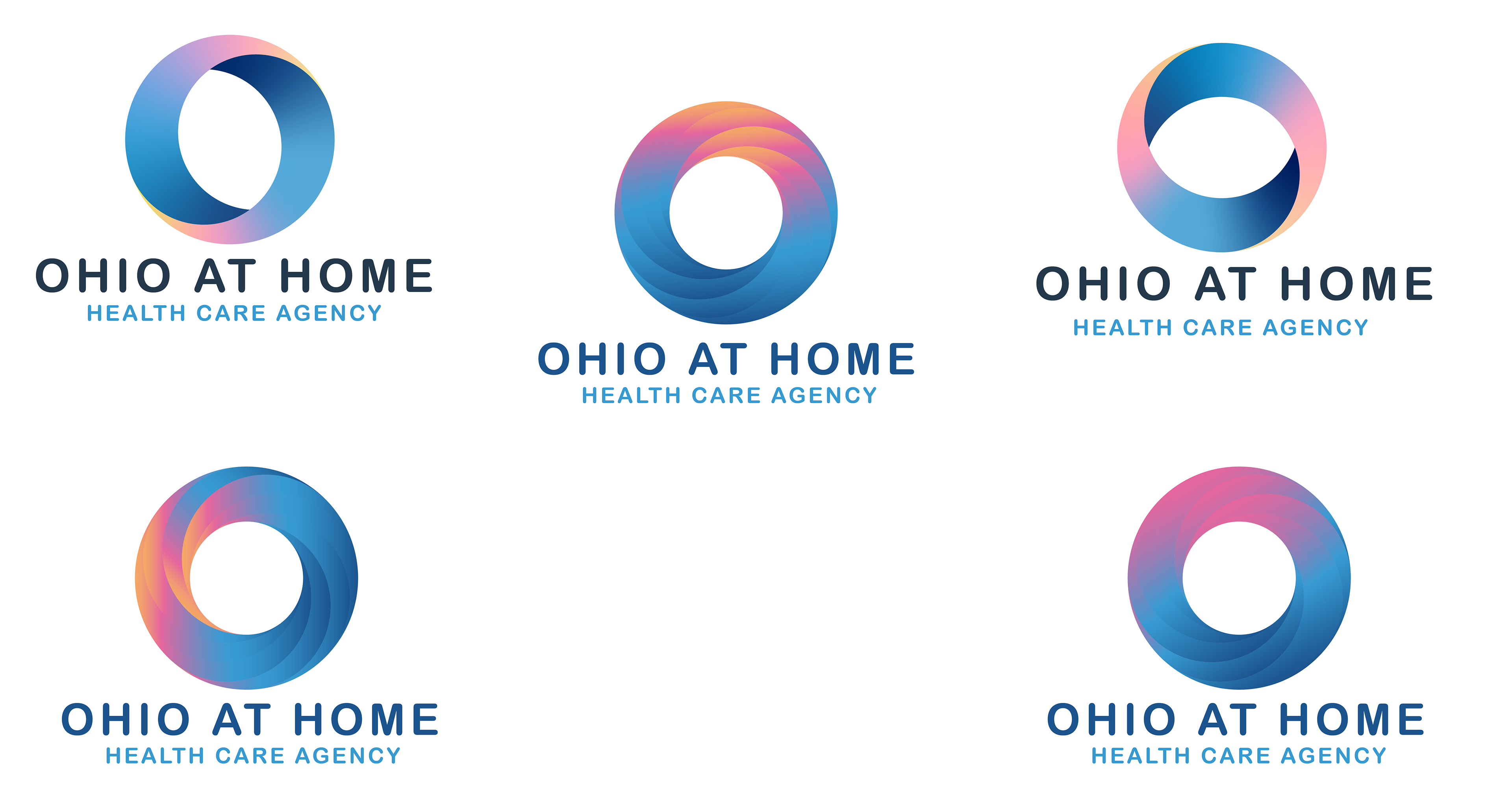
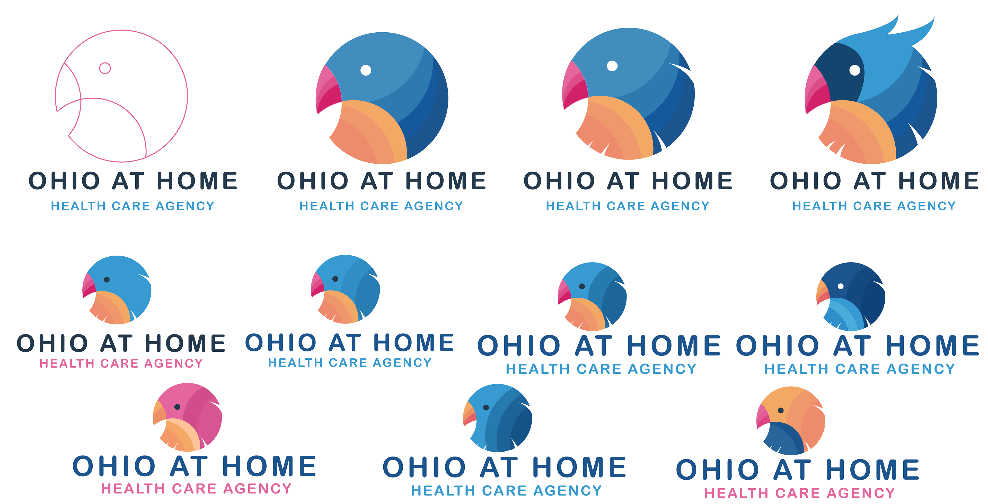
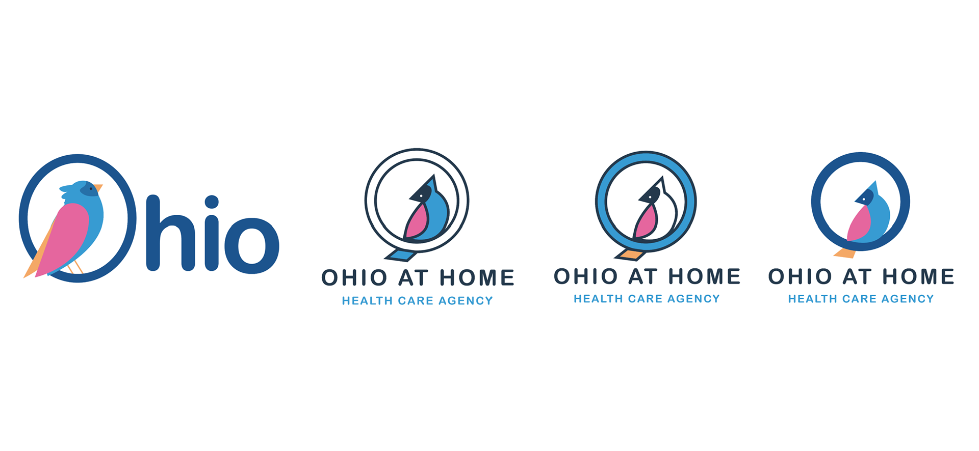
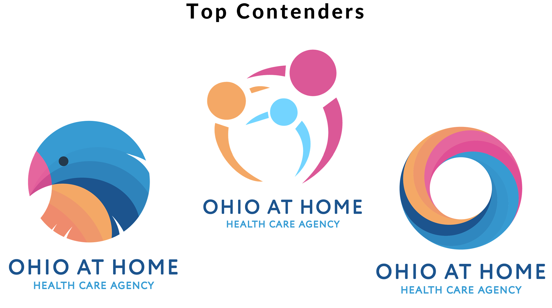
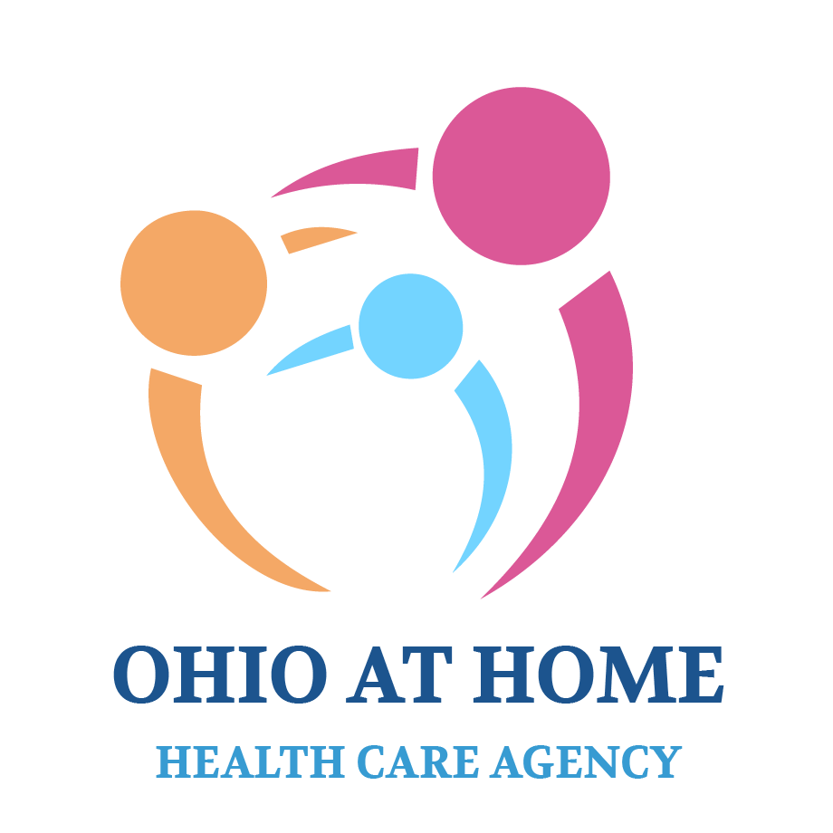
New Logo:
Here I explored new logo ideas. I tried specifically to incorporate themes of technology, or freedom. That's where the bird came in. I tend to try a lot of quick ideas on pen and paper first, then add color in Illustrator and a bit more polish.
We ended up giving the old logo a bit of a face lift with new colors.


Architecture:
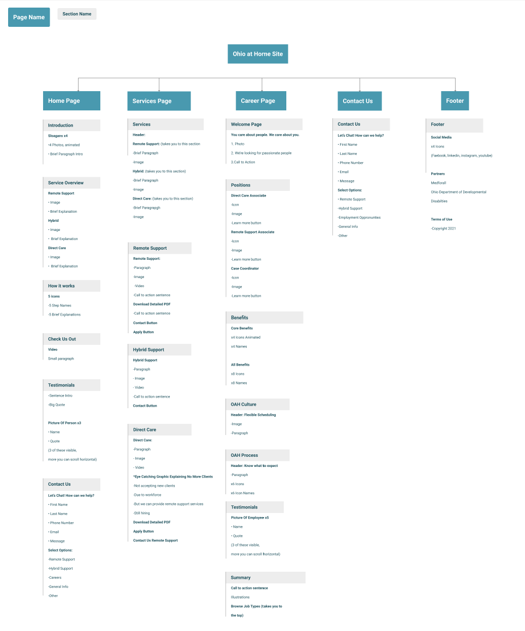
After identifying the MVP for the website (Home Page, Service Page, Career Page, and Contact Page) I created a simple site map to guide the design of the website. I made a user journey of several of the core interactions of the website. (ex. reaching out to receive services, or applying to a job.) I created user stories in Microsoft's list application, and confirmed them with the entire team before we proceeded forward.
Here are some examples of the lo-fidelity wireframes I made as well in Figma, for desktop and mobile.
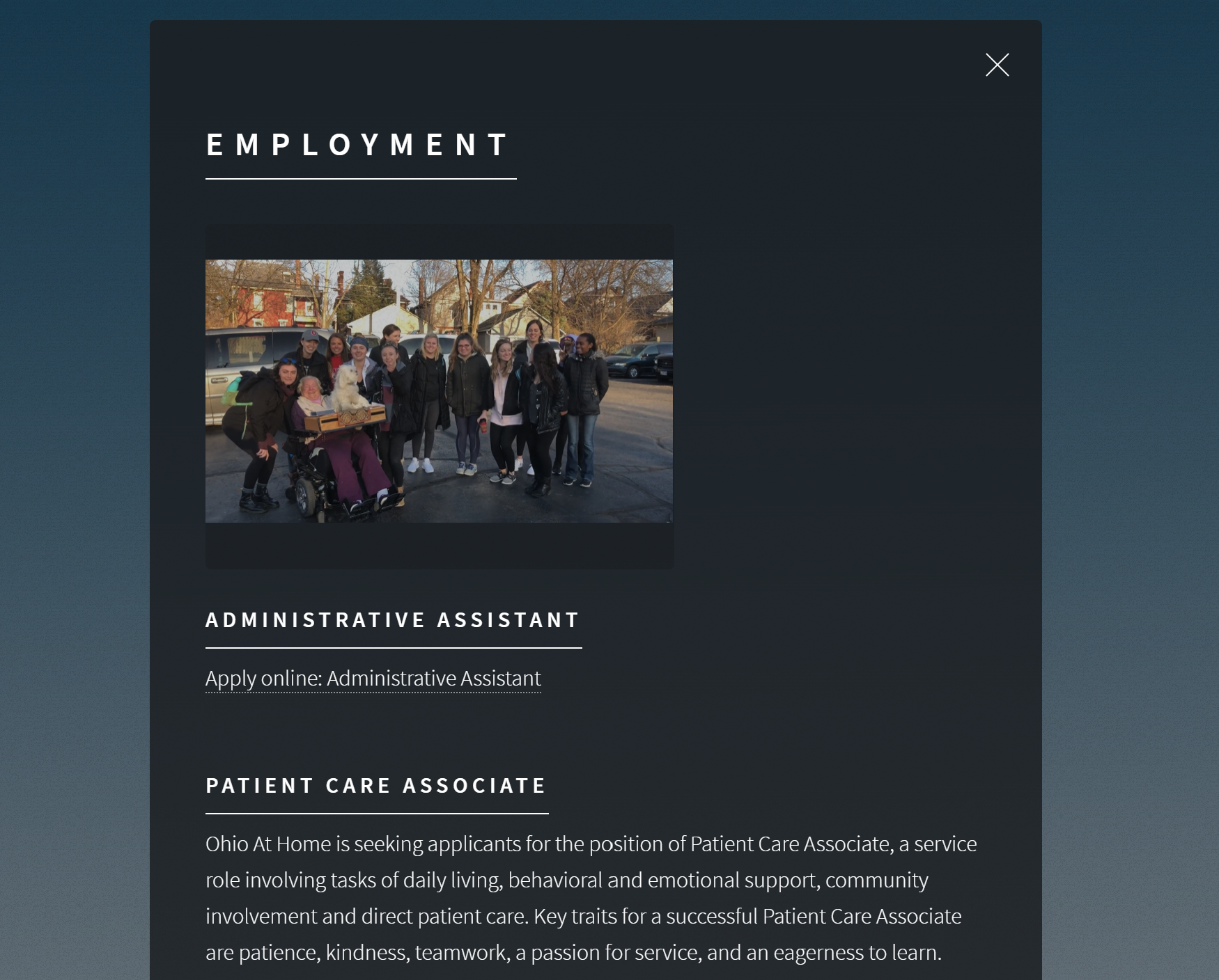
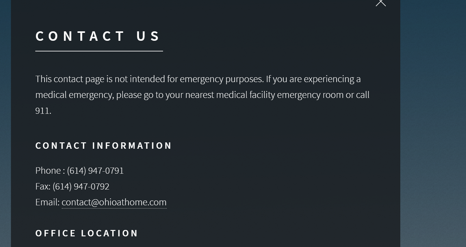
High Fidelity:
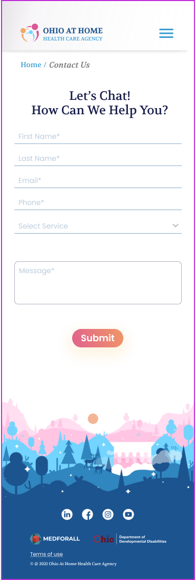
Here are some examples of the new website with our more finalized design - desktop and mobile. We wanted to it be clean, simple, and feature photography while pulling in the bold colors of the color scheme. I created all the icons, buttons, logo, and footer illustrations.
Copy Writing:
I wrote all the content for the website. To do this, I extensively researched best practices in language referring to people with disabilities. I wanted the writing to be as inclusive, simple, and approachable as possible while still remaining professional. With my competitive analysis of other healthcare agencies' websites, I determined a barrier for users getting help is getting bogged down by too much information. That's why I created simple descriptions of OAH's services, and created a form on the contact page where users could easily select or write what they needed help with, and not leave the site out of frustration.
Testing:
I also assisted the other UX designer and developer in testing the site and created a QA issue tracker where I documented all instances of issues. I organized issues into 3 categories: Assets, Functionality, and Written Content. From there, I documented what I found, potentially how to fix it, assigned the priority and who should tackle the task, and what device the issues were found on. This created a more streamlined way for team members to communicate and stay up to date on what the latest version of the website was, and what progress was being done on certain issues.

Results:
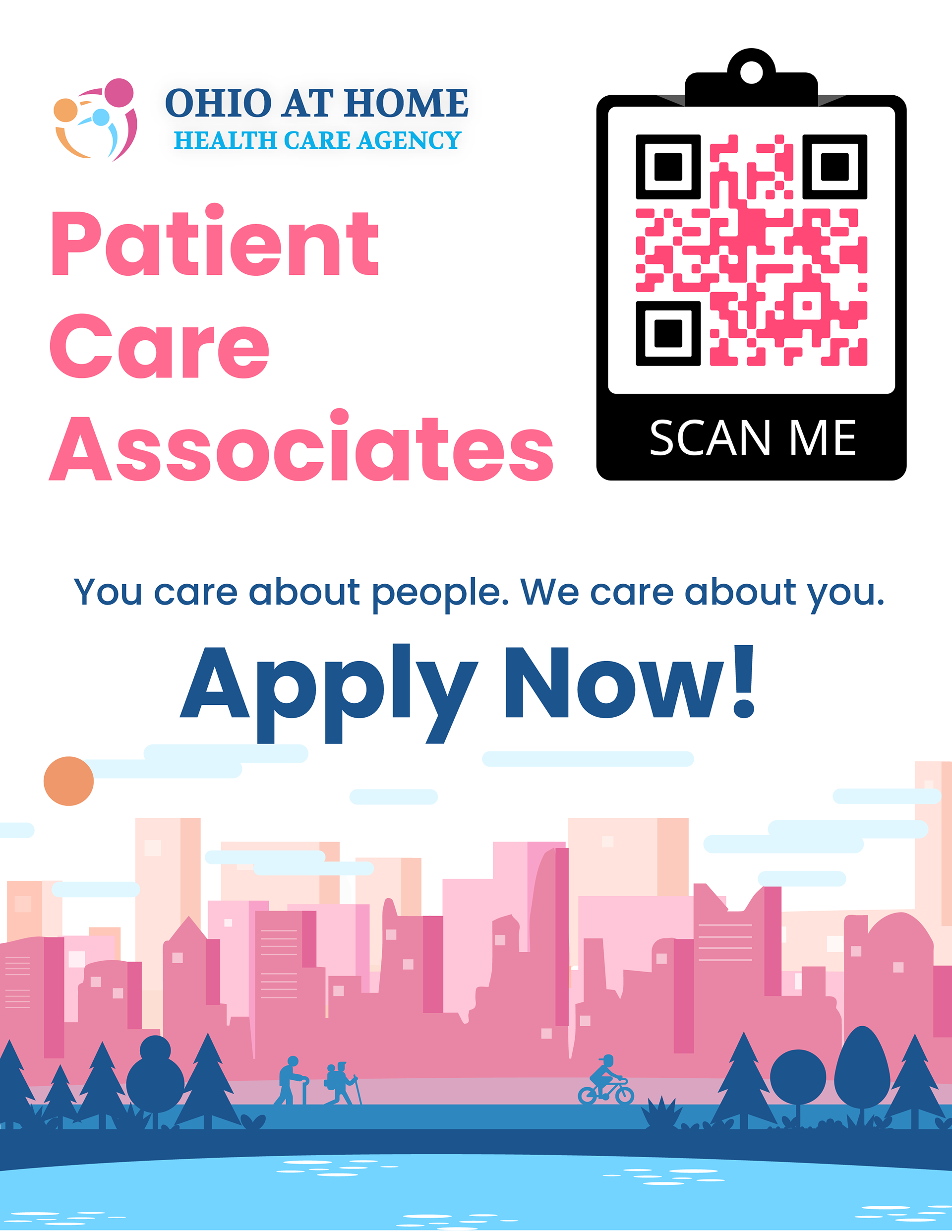
While the website is not officially up yet, OAH has already implemented the new brand, application process, and marketing materials into its business practices. As a result, recruitment efforts have improved, increasing new hires by 20%. They were able to track this date because of the QR codes I included in the marketing fliers.
In a sea of wordy, cumbersome, and confusing healthcare websites that don't represent the diverse range of people using them, this website stands out. The redesign is approachable, professional, and tells users only what they need to know with options to learn further by reaching out in a streamlined form submission or downloading informational PDFs. Healthcare shouldn't be hard to understand, and these websites often exclude their younger users with outdated designs. OAH's redesign will increase brand awareness and remove many of the barriers in receiving quality care that so many in the community desperately need.